$100 Millions worth Real Estate Giant now has a different Look
Initially called Outback Properties, Orban properties are in the exclusive real estate market of Australia. With a prospering market size of $38bn, the Real Estate industry of Australia has 49,582 Businesses. In such a competitive market with a high-value market size, the client needs to stand out.
Case Studies > ORBAN Properties
Brand Background
Companies like Goodman Group, Scentre Group, Vicinity Centres, and Stockland are leading the charts giving Orban Properties nothing less than strong competition. For these reasons and a multitude of others, the client requested a revamp. With an objective to make the brand more polished, BUOST set out to work. The client also requested a website with features that make searching properties with necessary details easier.
Case Studies > ORBAN Properties
The Solution
By carrying out a thorough investigation of the current market, trends, and competition, and by evaluating strengths and weaknesses, BUOST dived into the details.
Inspired by the existing Real Estate websites and user research, BUOST came up with novel concepts. With the client’s involvement, a site map and user flow were created incorporating all the sections that needed to be included in the site.
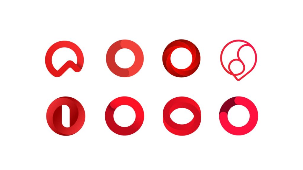
Working on the User Interface started with low-fidelity photo types which moved on to high-fidelity photo types created by Adobe XD that were sent to the client for approval. This progressed into the development process leading to the finalization of the website. The website colors were inspired by the brand guidelines to match the theme of the brand. According to the client’s feedback necessary changes were made. By using the previous logo as inspiration, a new logo was created by BUOST.
Case Studies > ORBAN Properties
The Result
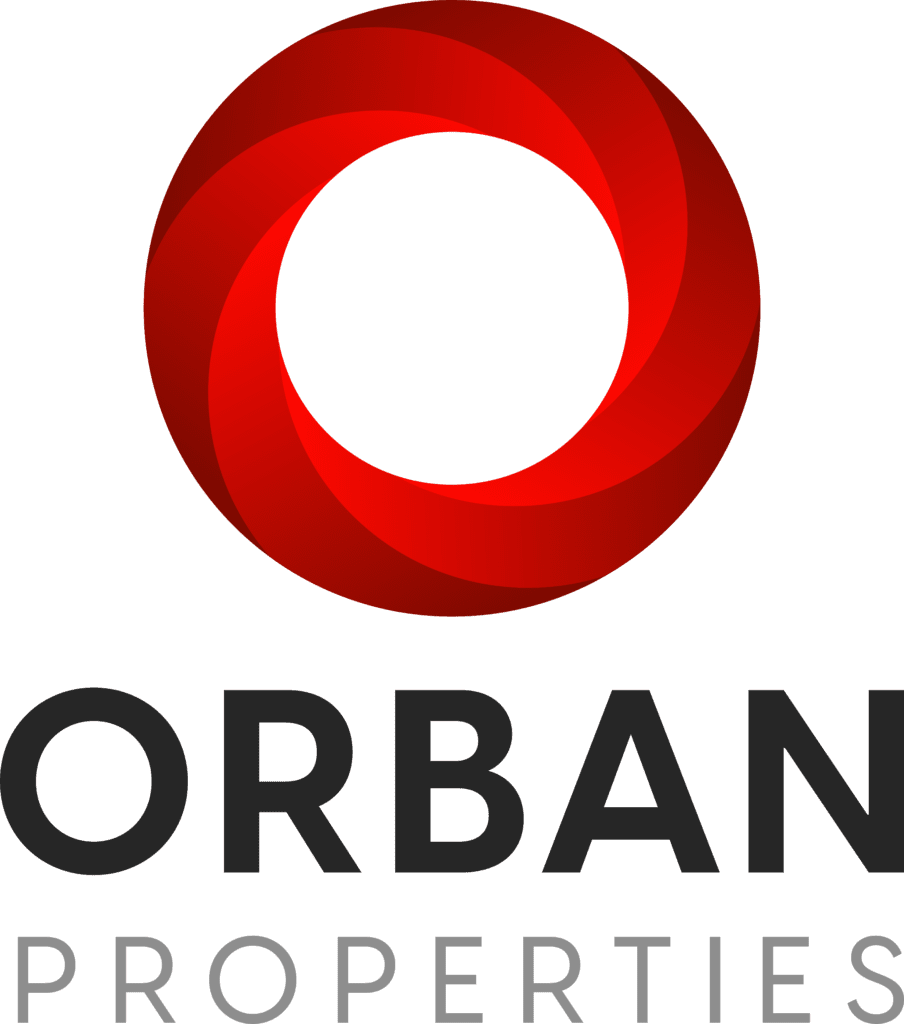
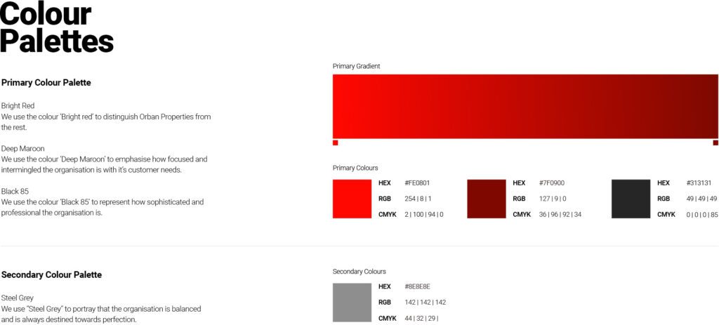
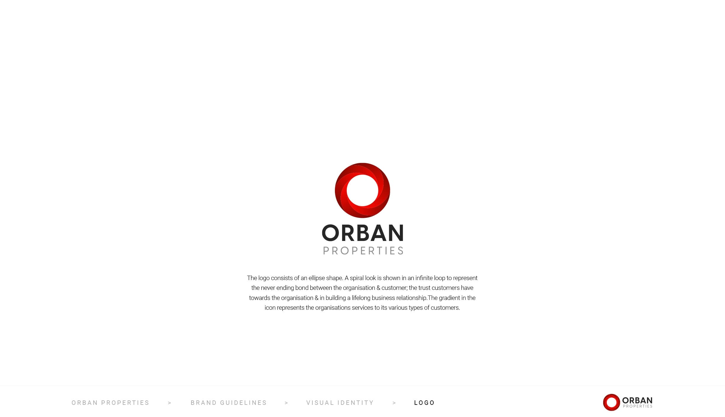
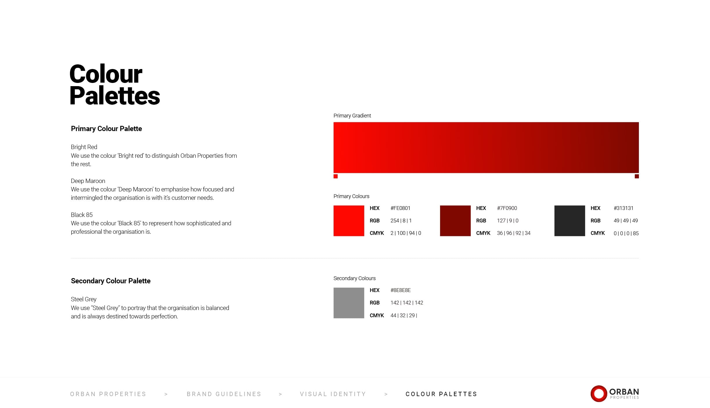
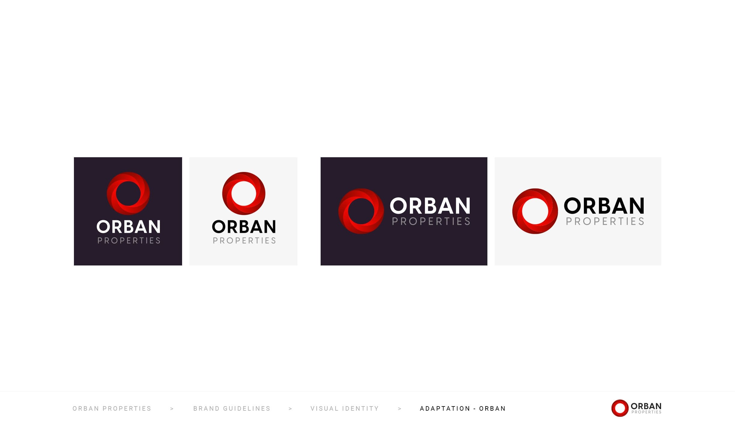
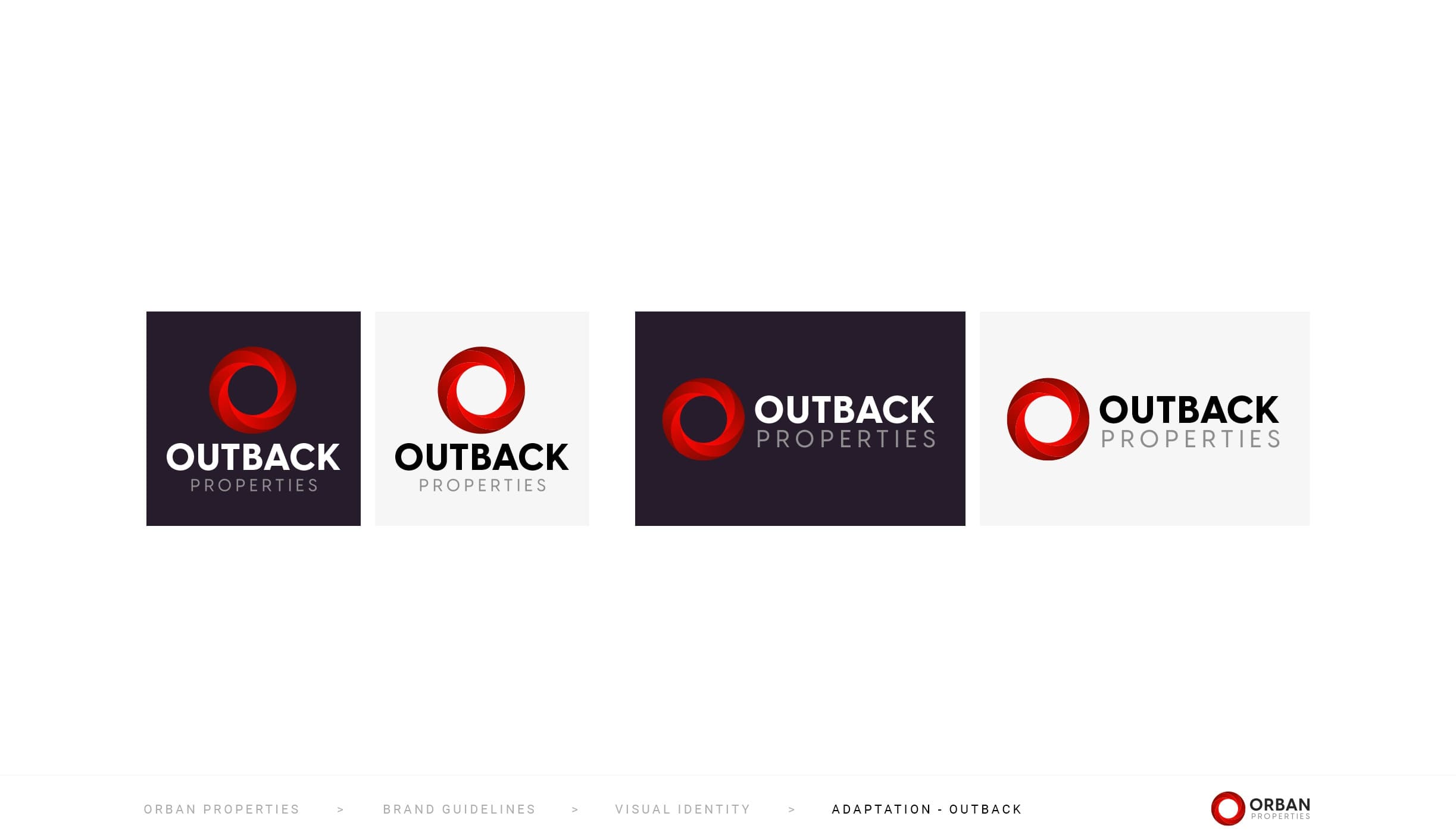
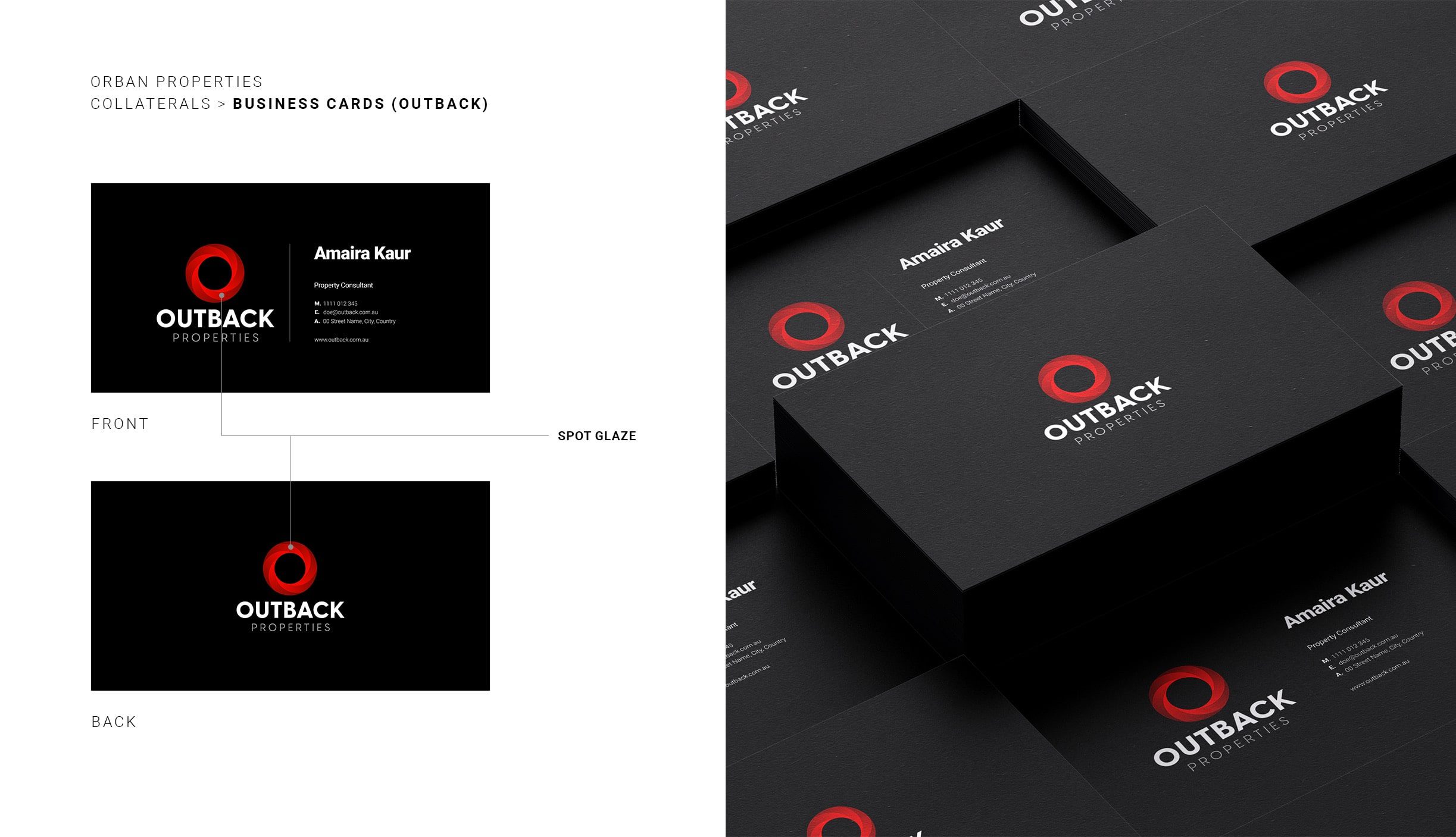
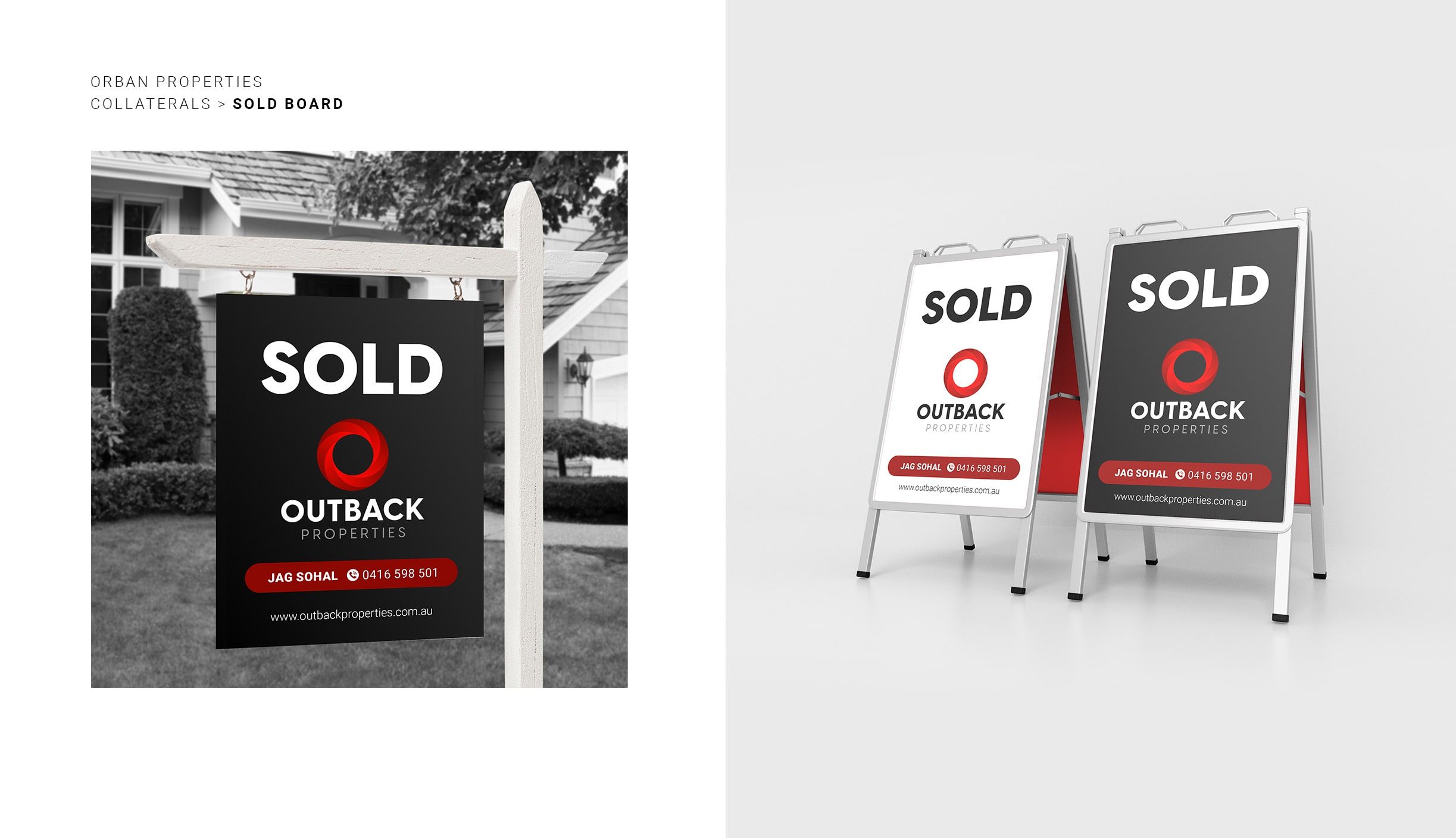
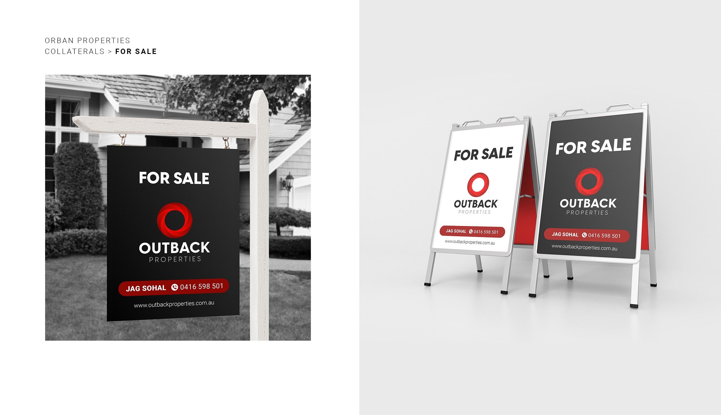
The finalized logo is an improved version of the initial logo of Outback Properties. The addition of primary colors: Bright Red, Deep Maroon, and Black 85; and the secondary color Steel Grey provides dimension to the logo to attract the customers’ eyes.
The spiral look in an infinite loop shows the never-ending bond between the organization and its customers, the trust customers have towards the organization, and the lifelong business relationship.
The website was curated for the customer by BUOST according to the client’s liking. With a search bar to easily navigate through the site, the new website enabled orderly listings of the available properties.
With an efficient team from BUOST who actively participated in meetings, making changes and upgrading according to client’s feedback, the revamp of the Real Estate company Oraban Properties was made possible.
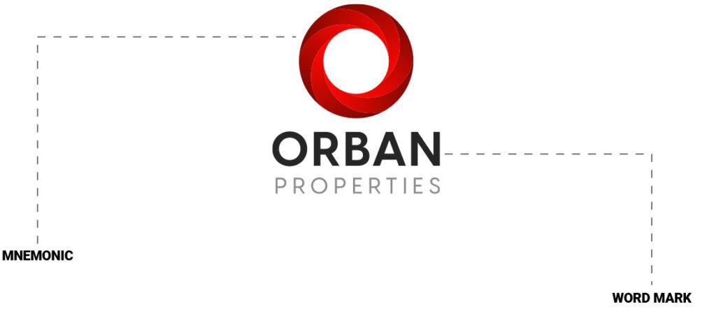
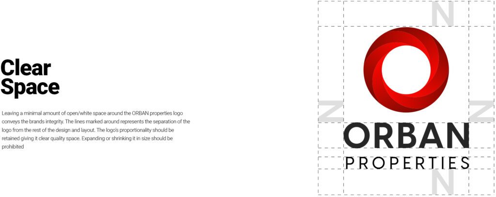
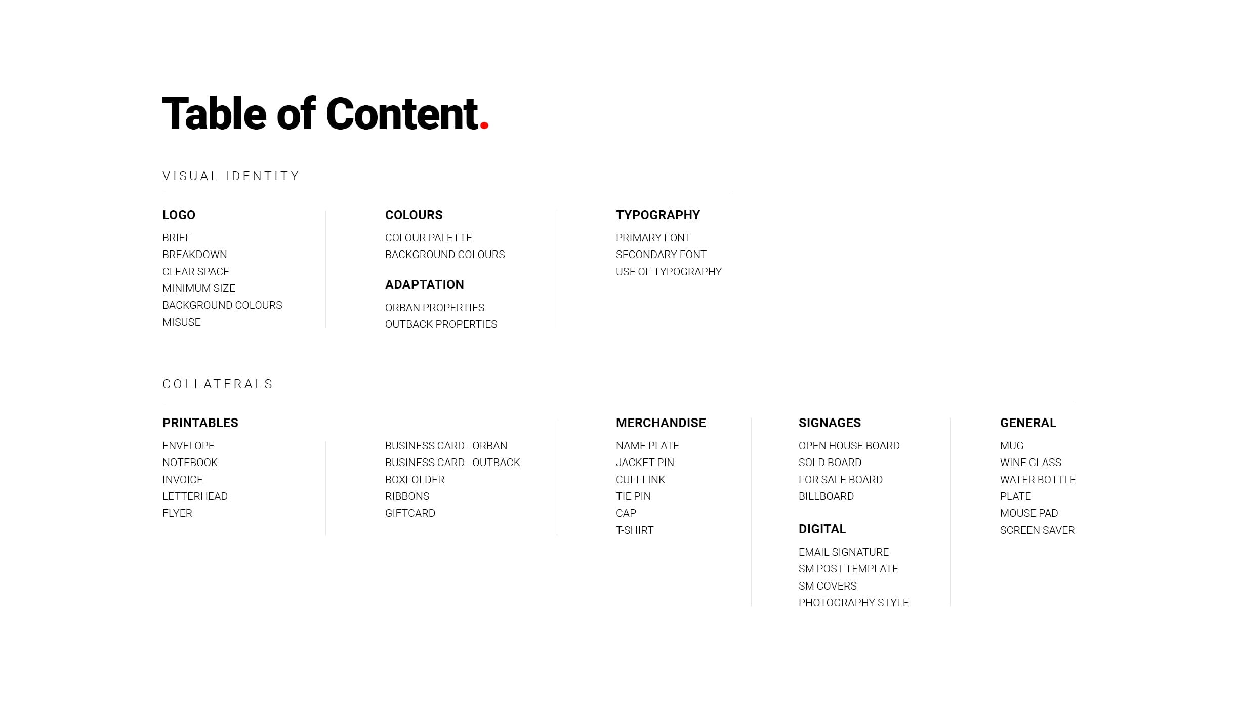
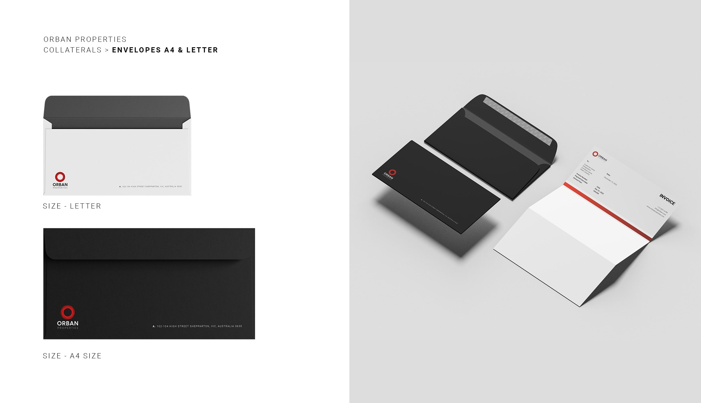
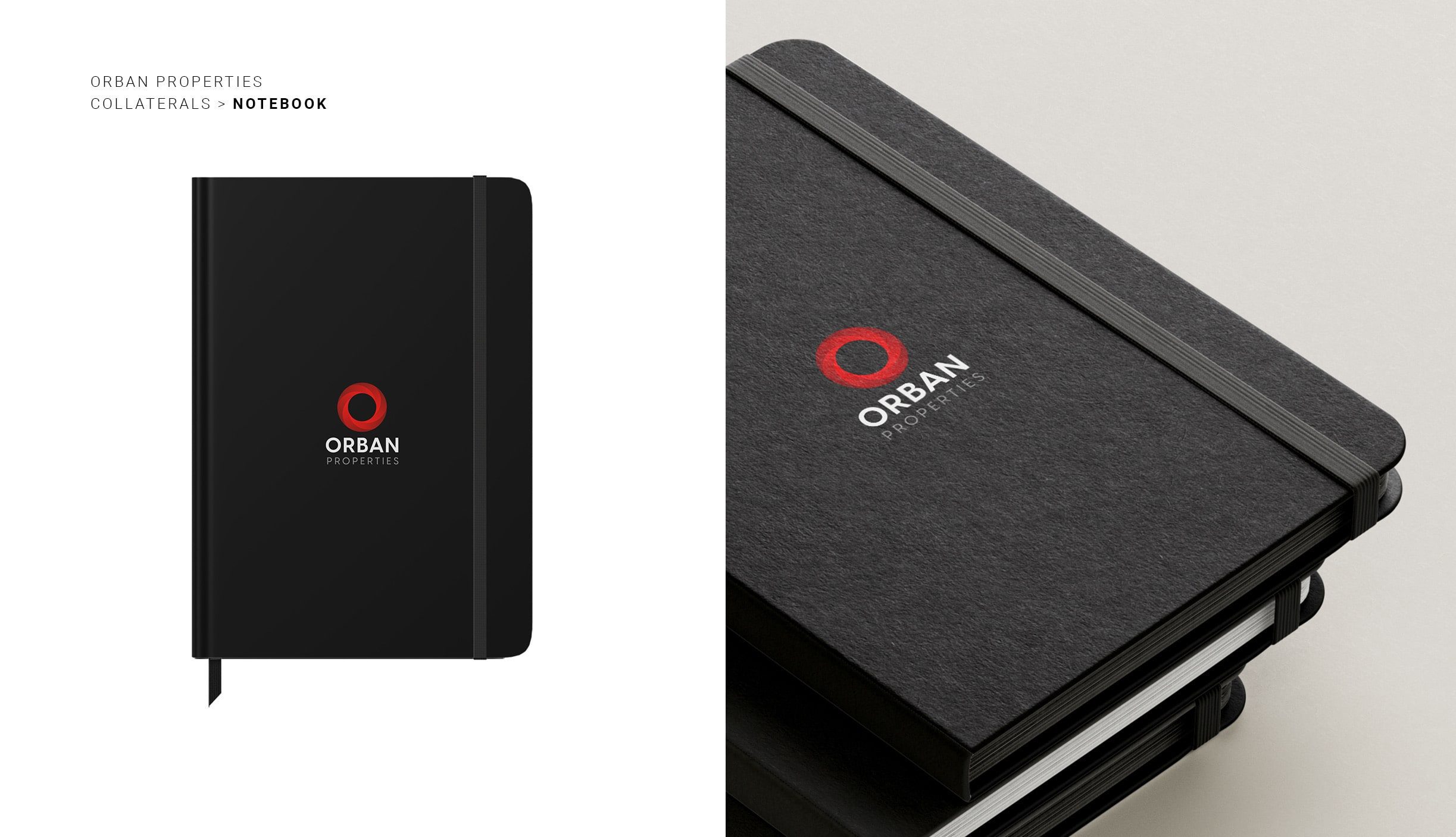
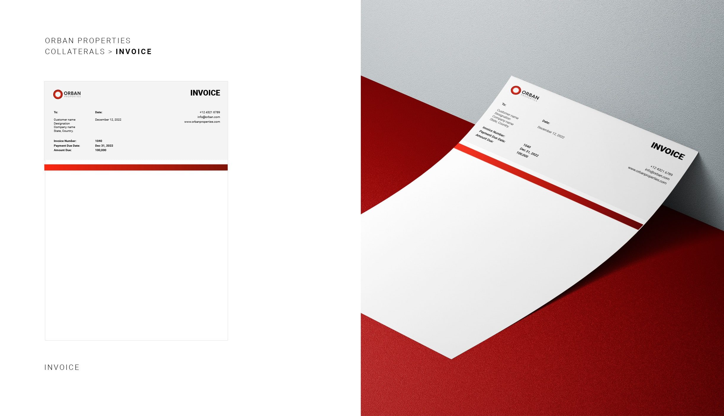
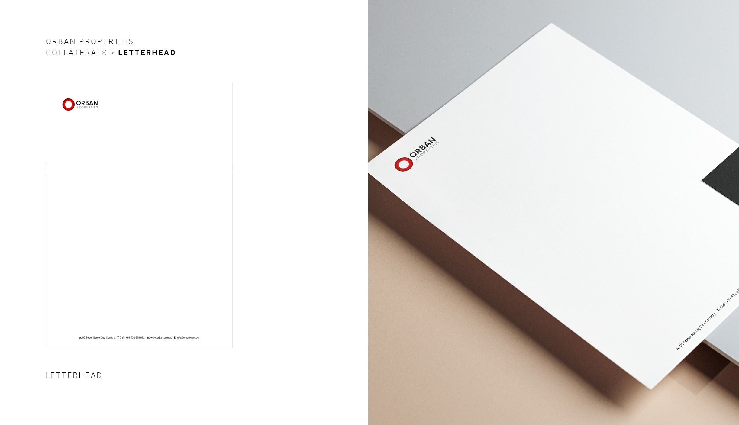
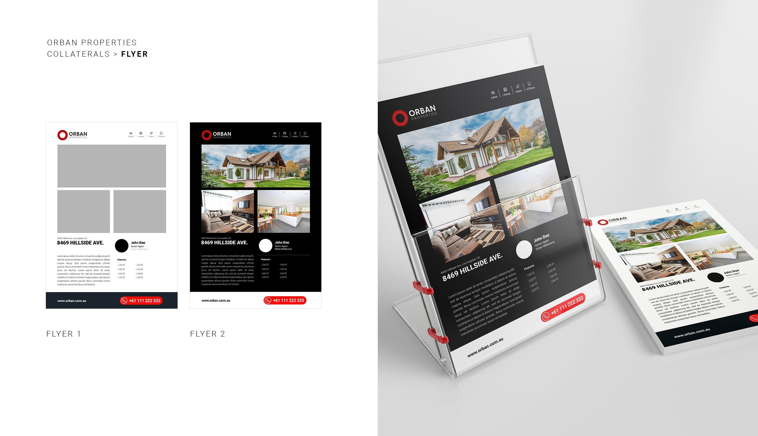
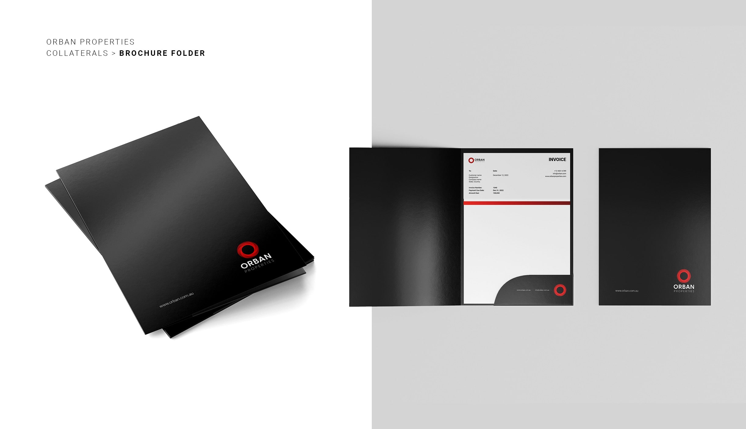
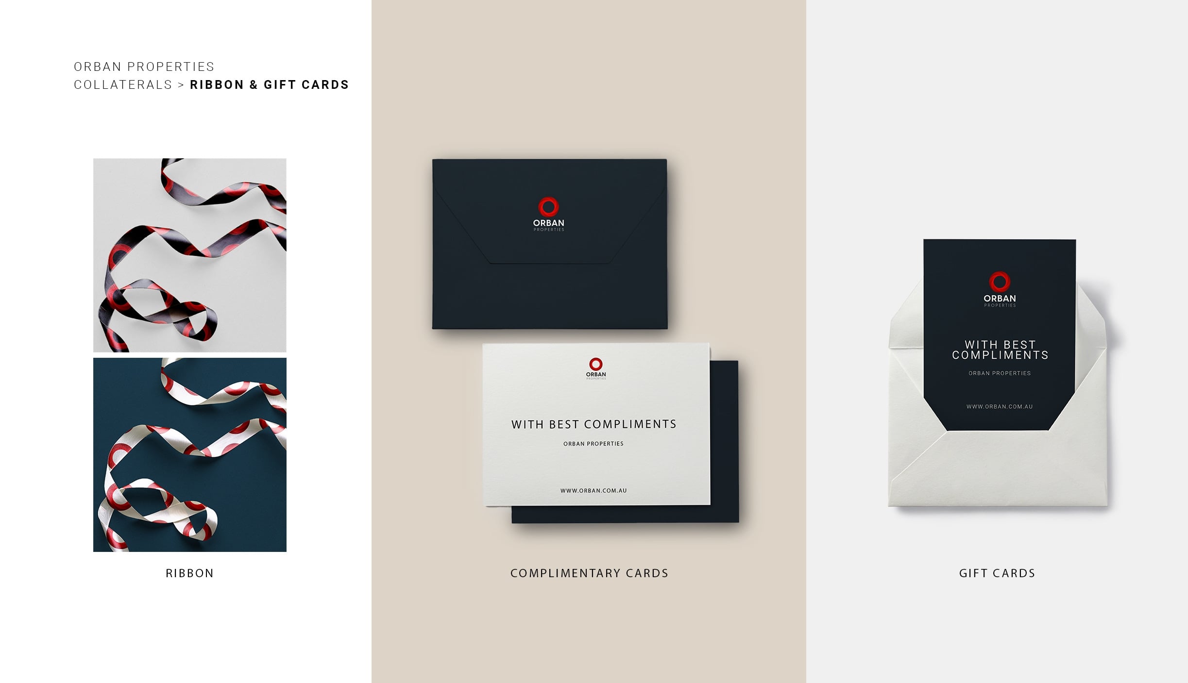
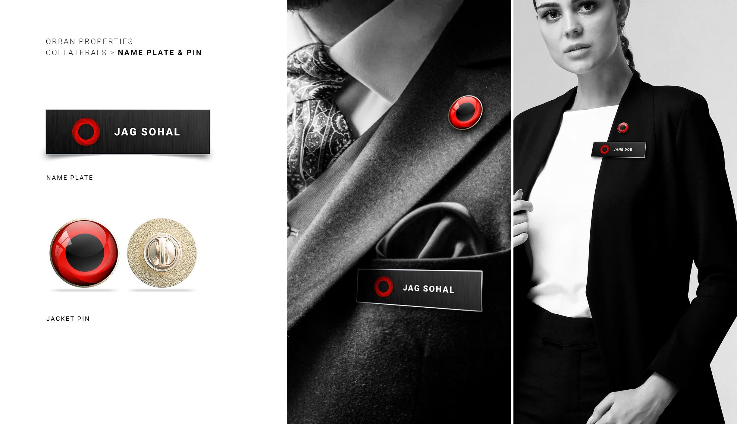
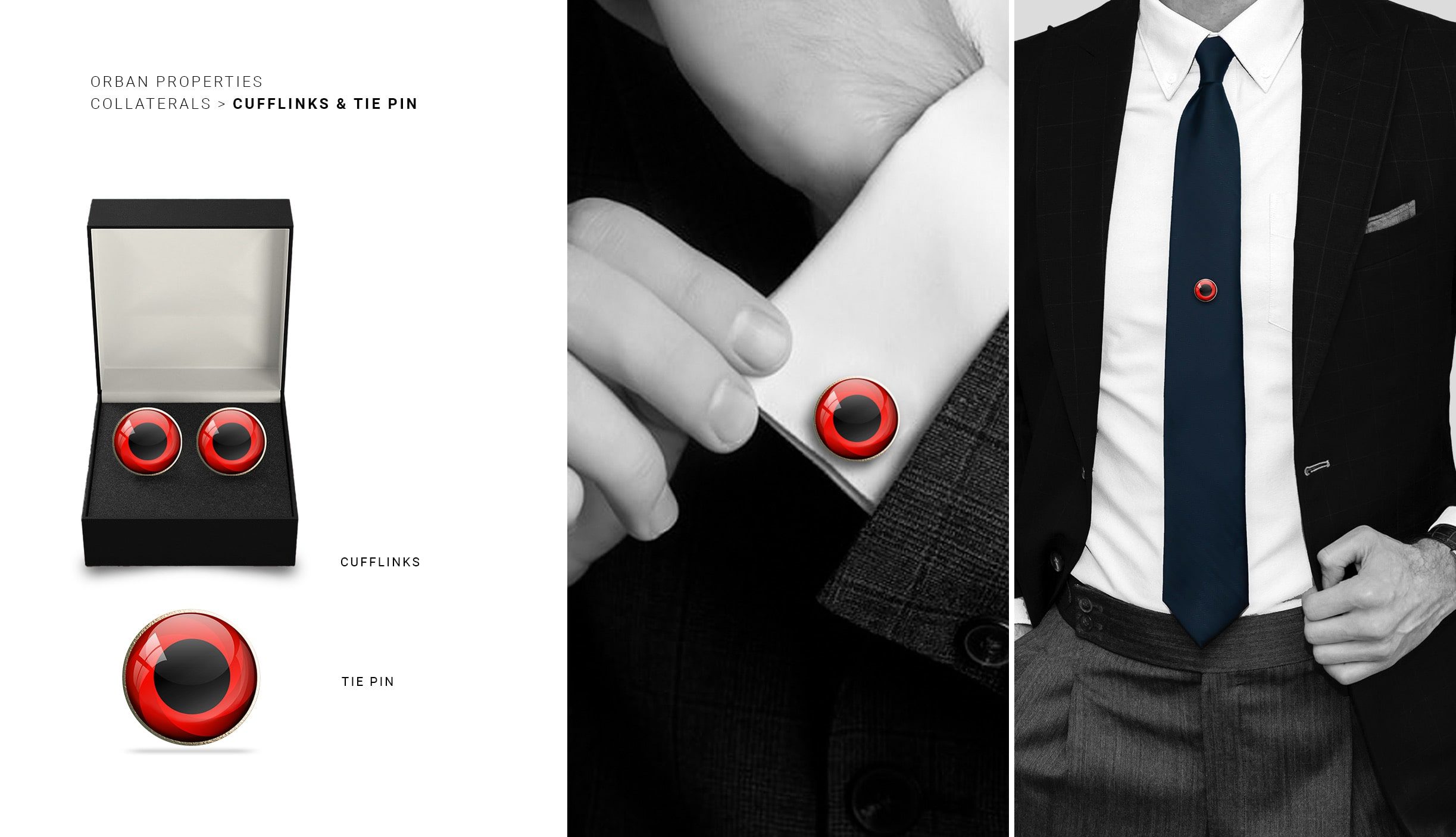
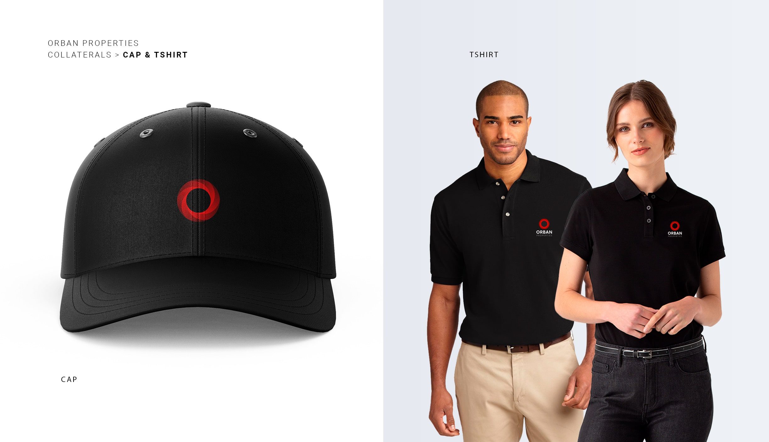
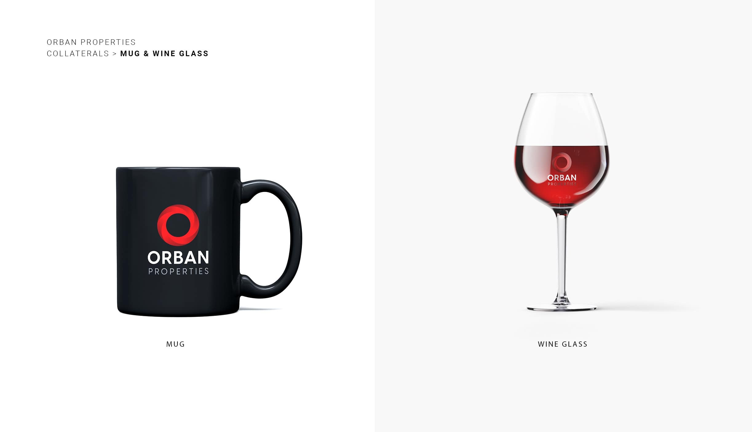
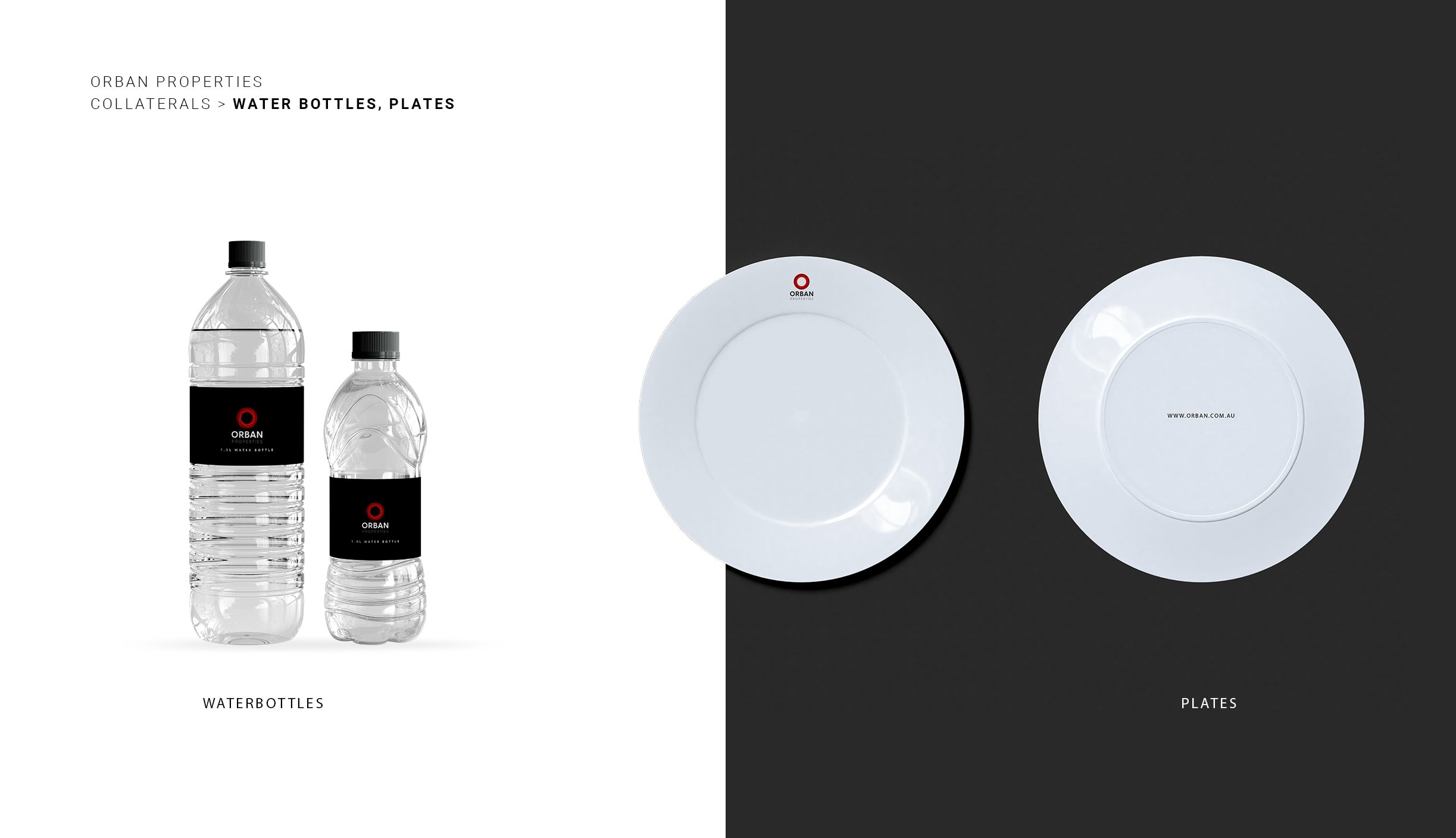
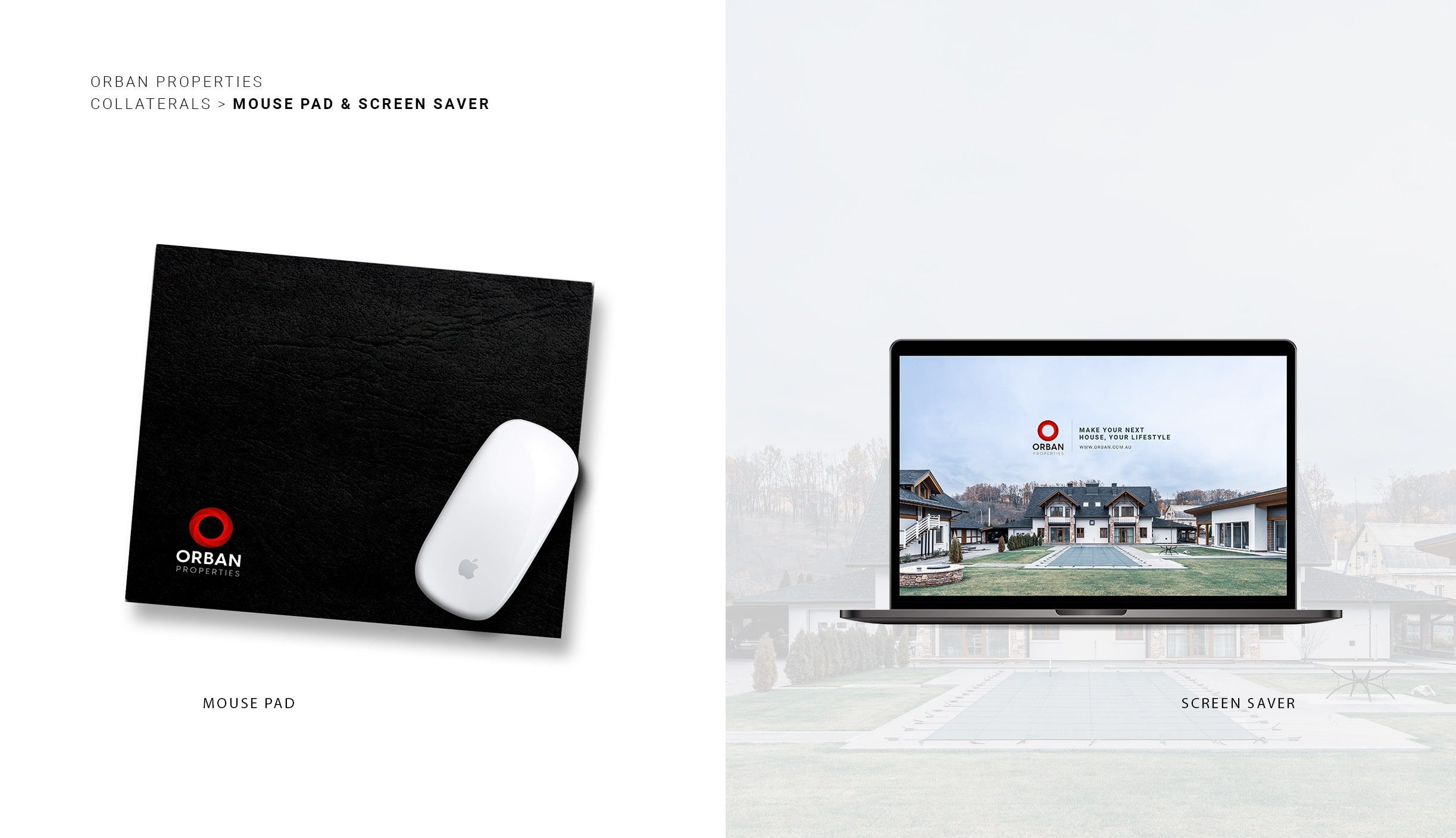
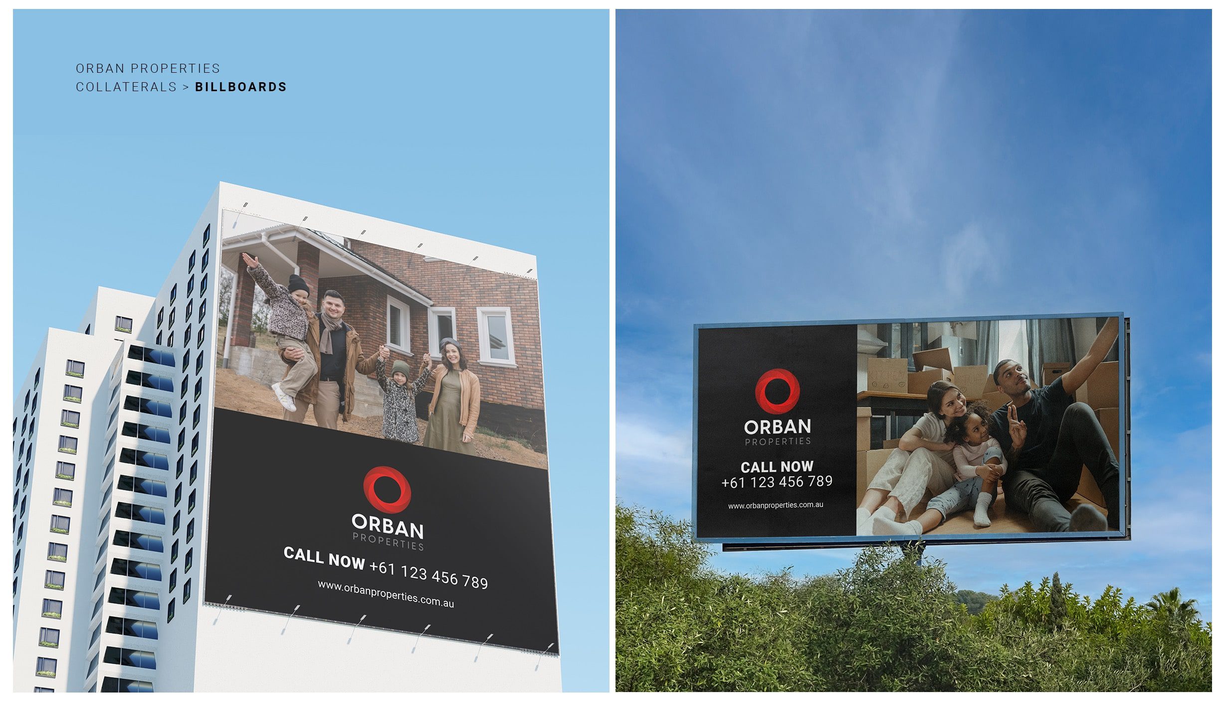
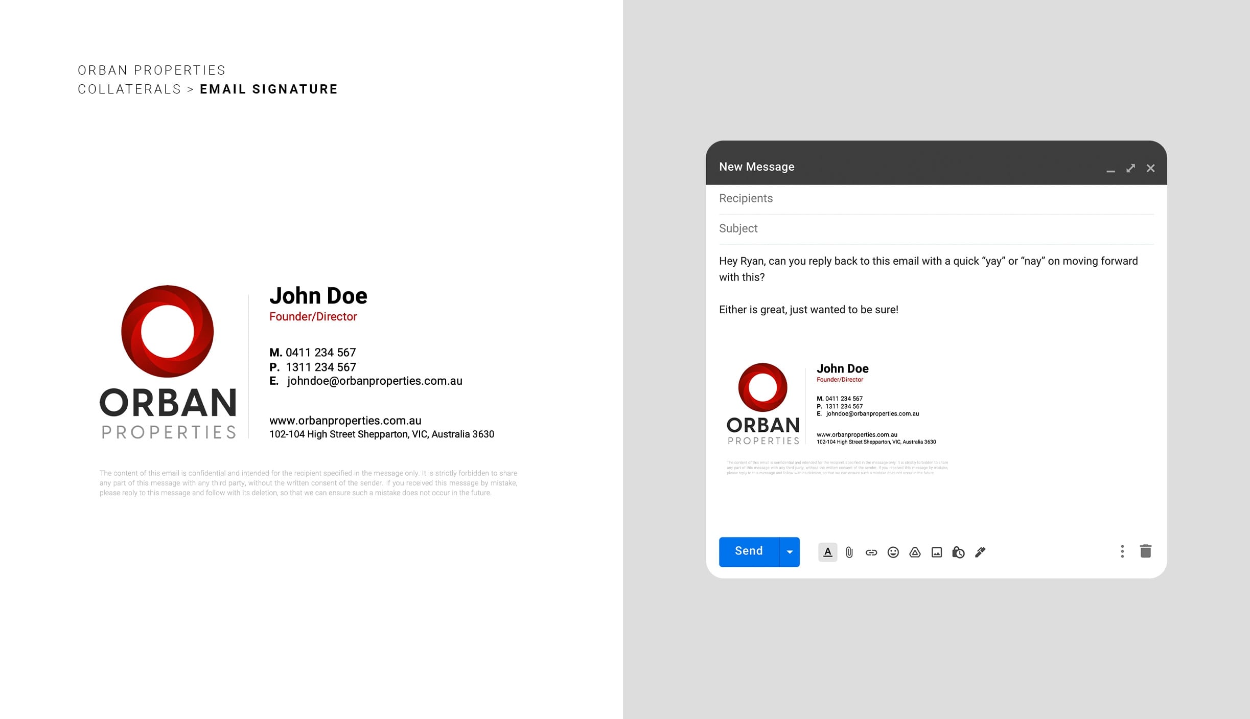
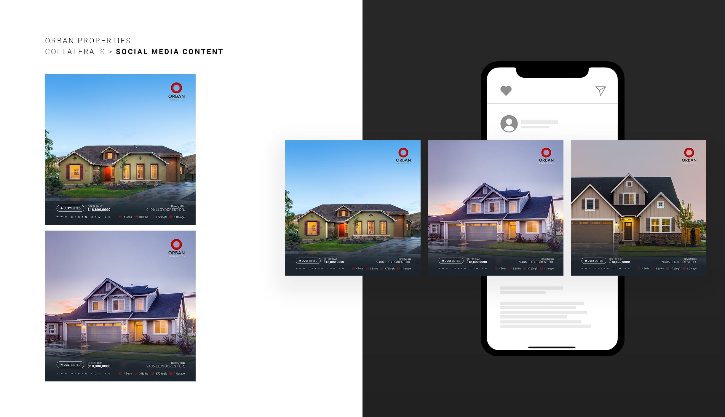
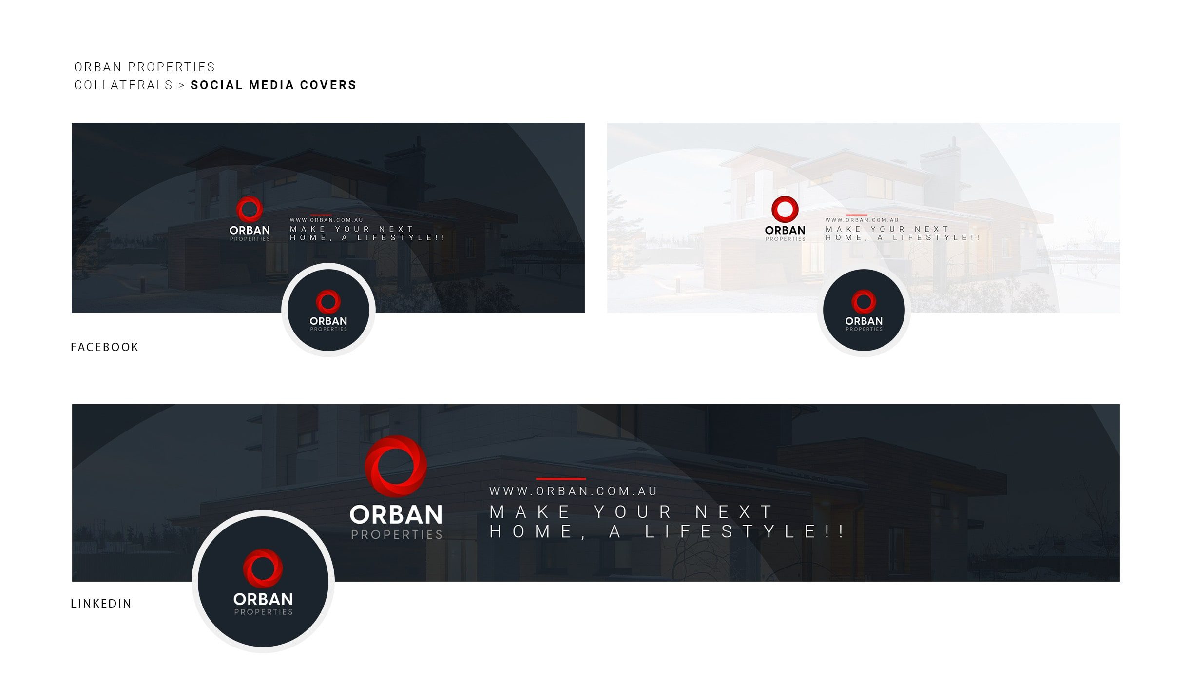
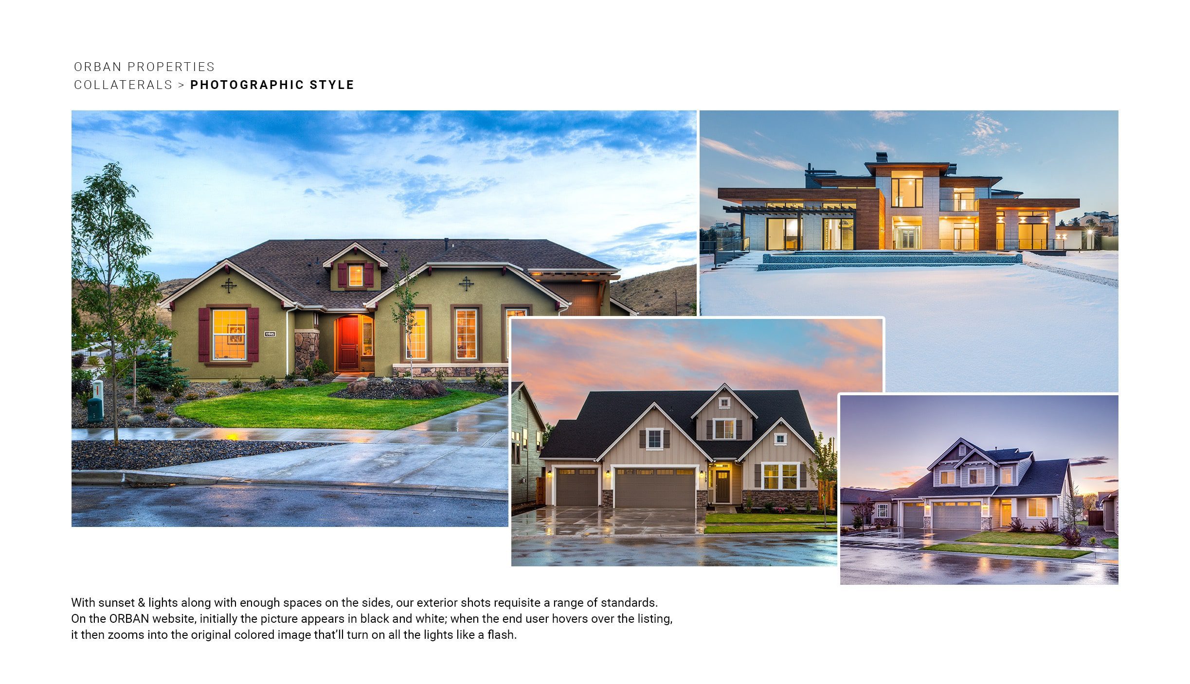
BUOST also provided a comprehensive document on brand guidelines, logo interpretations, and collaterals for the brand to advance in a manner that attracts customers and uplifts their brand.
Disclaimer Note :
The following case study presented for BUOST is intended for informational purposes only. It is important to note that the information provided in this case study is based on hypothetical scenarios and should not be considered as factual or applicable to real-life situations.
Readers are advised to exercise their own judgment and discretion when interpreting the information contained within this case study. The content provided should not be construed as professional advice, financial guidance, or legal counsel. The authors, contributors, and publishers of this case study bear no responsibility for any decision or action taken by readers based on the information provided herein.