Introduction
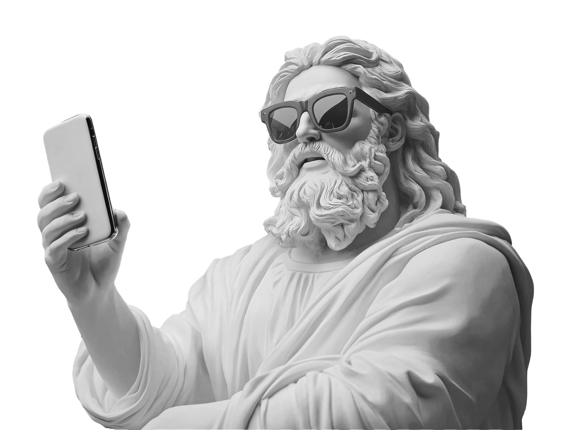
Buttons may seem like small elements in the grand scheme of user experience, but they hold immense psychological influence. Their shape alone—whether invitingly round or boldly square—can subtly impact user emotions, trust, and decision-making. So, let’s dive into the timeless debate on button design, exploring its history, psychology, and a few playful puns along the way.
A Little History of Buttons in UX
Back in the early days of GUIs (Graphical User Interfaces), buttons were born out of necessity. Operating systems like Windows 3.11 and early websites used skeuomorphic designs—raised, 3D buttons that screamed, “Click me! I’m important!” These buttons relied on gradients, shadows, and outlines to mimic physical buttons, making them instantly recognizable.
Fast-forward to the present day, and the skeuomorphic era has largely given way to flat and minimalist design trends. But the influence of those early buttons endures, especially in legacy systems-lookin’ at you, Windows XP. Yet despite these visual evolutions, one core question has persisted: What shape should your buttons be?
Why Rounded Buttons Feel Friendlier
Rounded buttons are the extroverts of interface design—welcoming, approachable, and eager to make connections.
- Psychological Comfort
- Neuroscience confirms it: sharp edges can trigger subtle stress responses in our brains—thanks to evolutionary biology. In contrast, rounded corners create smooth, organic shapes reminiscent of those found in nature, helping users feel more at ease.
- Focus Factor
- Rounded buttons naturally draw the eye inward, guiding attention to their content—whether it’s a “Subscribe” prompt or a “Shuffle” command.
- Modern Appeal
- Younger audiences associate rounded buttons with modern, touch-friendly design. Just think of Instagram or Spotify, where those soft edges create seamless and enjoyable interactions.
- Boost Engagement
- Other platforms, like Apple iOS, have rounded corners across their ecosystem, giving a harmonious feel that makes it more usable and enjoyable.
Why Square Buttons Mean Business
Square buttons are formal and exact. They’re the button equivalent of a well-tailored suit: sharp, structured, and commanding respect.
- Professional Vibes
- By default, square buttons are used for financial, legal, and data-driven applications. They provide a sense of seriousness and dependability, which is great for environments where trust and accuracy are needed.
- Clarity and Structure
- The clean lines of square buttons complement professional settings like LinkedIn or Google Ads, where clarity and precision are paramount.
- Trust Through Authority
- Banking apps, like HSBC or Chase, use square buttons to project a no-nonsense, secure image.
Rounded vs. Square: Where They Work Best
- Instagram
- The rounded buttons, like the “Follow” or “Message” buttons, reflect Instagram’s friendly and playful nature. Impact on Engagement: The soft edges create a relaxed and approachable interface, pushing users, particularly younger audiences, to interact more often.
- Apple iOS
- Rounded corners on the iOS are used for almost every functional component, such as buttons, modals, and alerts. Impact on Engagement: Coherence and visual harmony across apps make users easily navigate and get comfortable; it adds to usability and satisfaction.
- LinkedIn
- The sharp-edged buttons of LinkedIn, such as “Connect” or “Message,” denote professionalism and seriousness. Impact on Engagement: The formal design resonates with its professional audience, fostering trust and reinforcing LinkedIn’s purpose as a career-focused platform.
- Google Ads
- Google Ads uses sharp-edged buttons for options like “Create Campaign.”
- Impact on Engagement: The precision and no-nonsense design align with the platform’s goal of driving business results, appealing to users in structured, goal-oriented environments.
- Key Takeaways on Impact
- Rounded Buttons: Facilitate higher engagement since it gives a friendlier and more approachable vibe. It works perfectly for social, lifestyle, and entertainment apps.
- Sharp Buttons: They reinforce structure, formality, and authority. They work best in professional, financial, or data-driven contexts where trust and clarity are key. By harmonizing button shapes with your brand identity and the needs of users, you can shape how users view your product and engage with it.
Edging Towards Best Practices
But here’s the kicker: Shape alone isn’t enough. A button’s effectiveness also depends on how well it follows these basic UX principles of a button. Here’s how to make your buttons pop-not users’ stress levels:
- Keep It Simple : Confusing buttons are just… buttons that don’t get clicked. Professional doesn’t have to mean convoluted commands. A button that reads “Join Now” is so much more effective than “Commence Membership Enrolment.”
- Clarity is Key : Make sure users know exactly what will happen when they click. If the purpose of the button is not crystal clear, adding a hint could be a good idea. For example, instead of using just “Download”, use “Download Free Guide”.
- Speak Their Language : Your users aren’t interested in jargon; they’re interested in results. Research their language and mirror it in your button copy.
- Create Urgency or Desire : Emotion drives buttons like “Claim Your Free Trial” or “Limited Seats Available.”
The Final Click: It’s Not About Shape, It’s About Purpose
Let’s get one thing straight: There’s no one-size-fits-all button. The choice between rounded and square buttons depends on your brand voice, target audience, and desired emotional response. So, whether your buttons are edgy and square or soft and round, remember this: It is how they make users feel that really shapes the nature of the engagement.
Next time you’re designing an interface, remember: you’re not just choosing a shape-you’re choosing a mood. Whether you go for the soft embrace of rounded edges or the sharp precision of square corners, your buttons can guide users toward trust, excitement, or a sense of urgency. So go ahead, push the right buttons—and keep it “rounded” or “sharp” depending on your audience’s needs. After all, it is hip to be square… but sometimes you just need to round things out!