
A new look for Australia’s favorite pet store
The pet furniture industry in Australia has a flourishing market, where consumer demand is rising by the day. The global pet furniture market size was valued at USD 2.1 billion in 2018. With the increasing market, the client’s requirement to stand out as a brand against existing
companies is more than ever.
Case Studies > Frank & Arlo
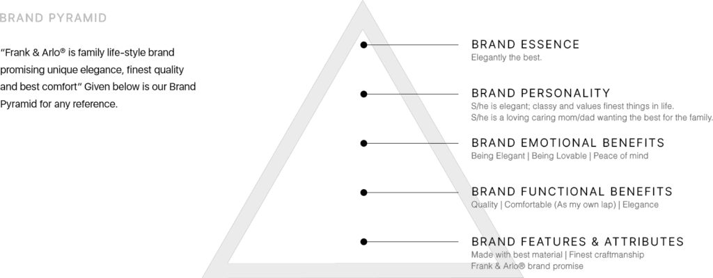
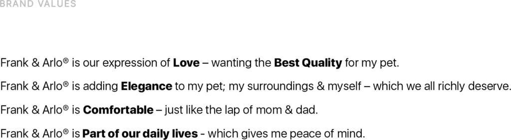
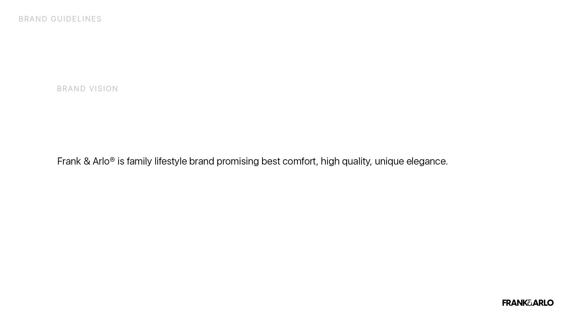
Brand Background
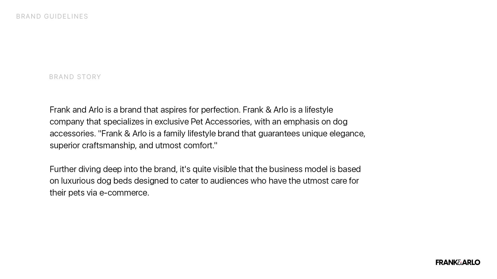
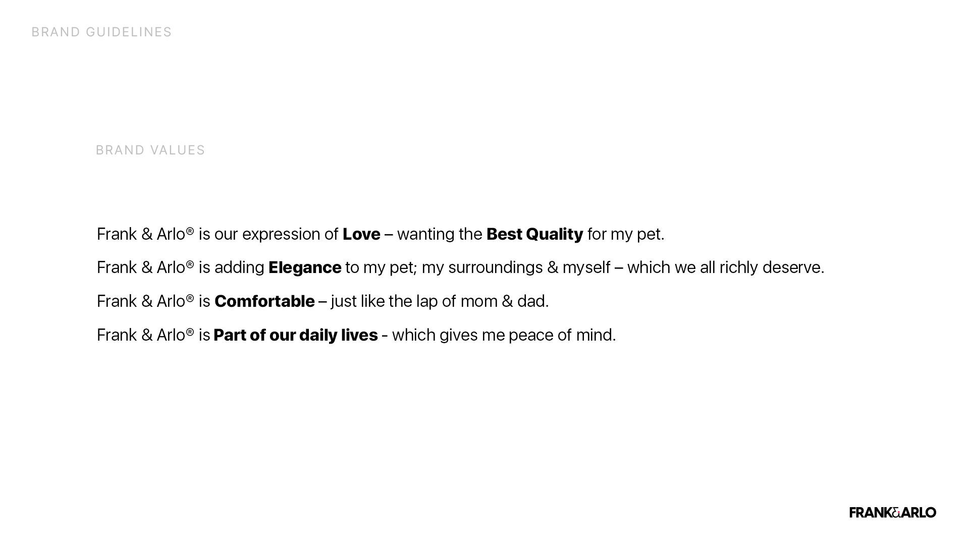
Going against companies like PaWz, Pet One, Best Kept Pets, and Wagging Tails, Frank and Arlo were not short of competitors. Gaining attention against these companies was one of the biggest tasks the client requested BUOST. Following closely on this, the client agreed upon a complete brand revamp. The objective of the revamp was to make the company look more polished and elegant, which we at BUOST believe will, directly and indirectly, increase their revenue, and create a better reputation and rapport among shoppers, inevitably attracting more customers
Case Studies > Frank & Arlo
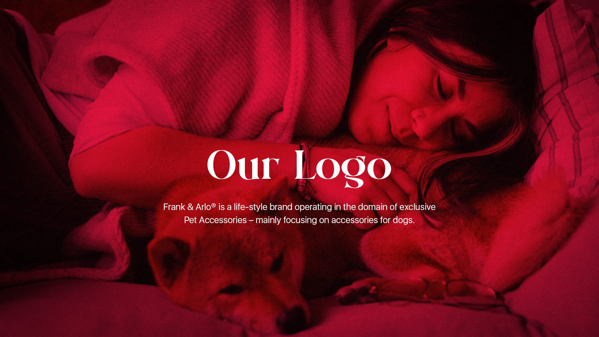
The Solution
Upon the client’s request, we at BUOST did not hesitate to deep dive into the details –
identifying their current concerns, examining their competition and market scope, and evaluating strengths and weaknesses in the brand. After formulating a Pick Deck, we proceeded to the project’s next steps.
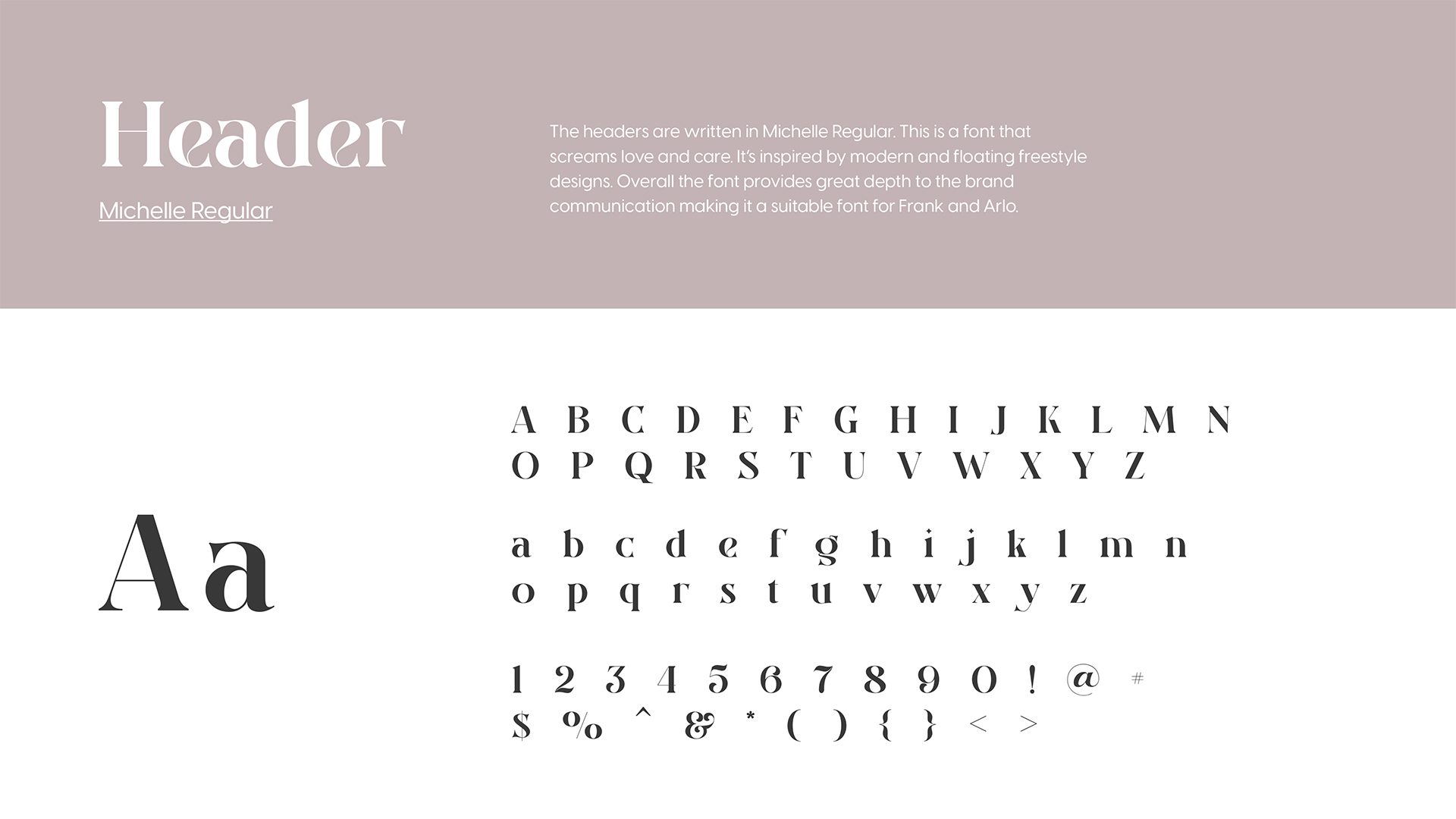
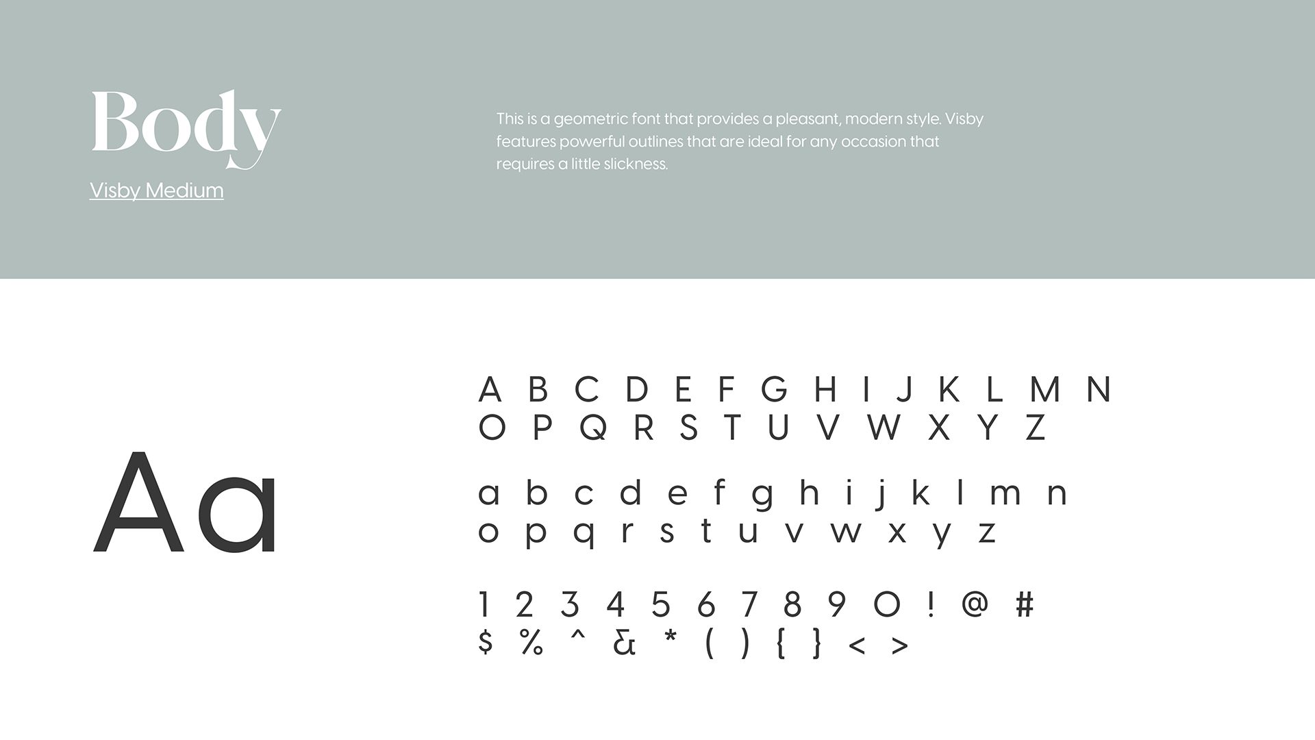
These were the initial logos we created for Frank and Arlo. Upon careful consideration of the competitors’ brand logos, fonts, and colors, we came up with a logo that is a modified version of the existing one, yet more sophisticated to make it stand out. Improvements were made as per the client’s request and feedback. The previous logo options were modified according to the client’s liking.
We at BUOST did several weeks of research to be equipped with sufficient knowledge to understand the market scope and methodologies to lead this brand to success.
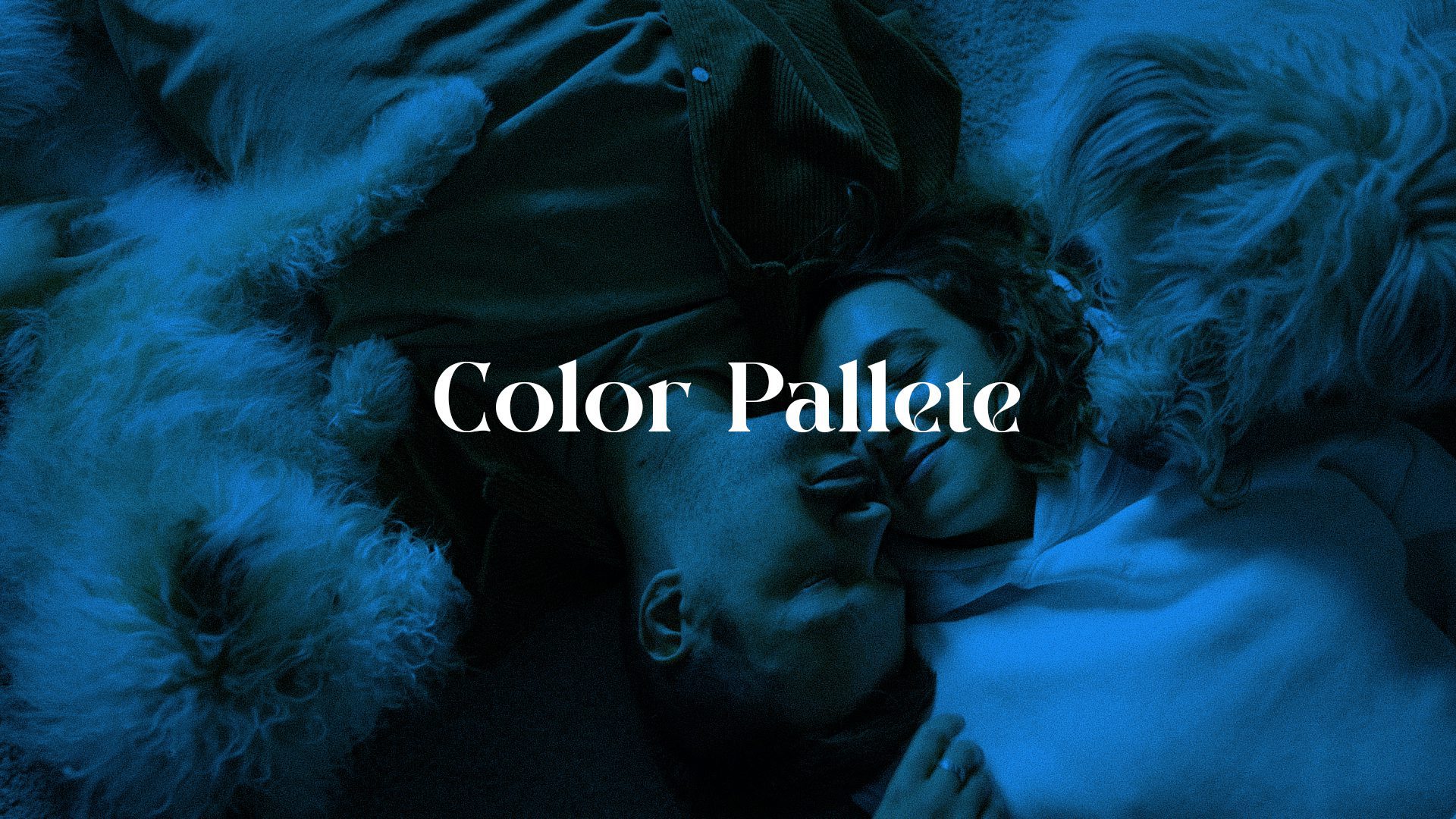
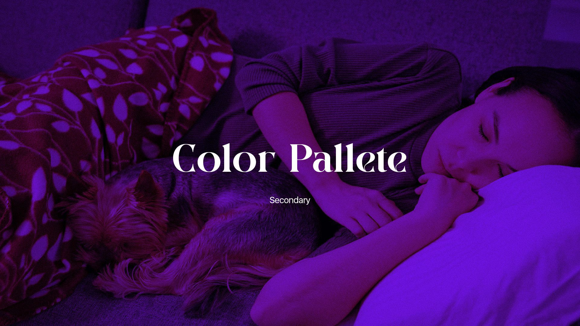
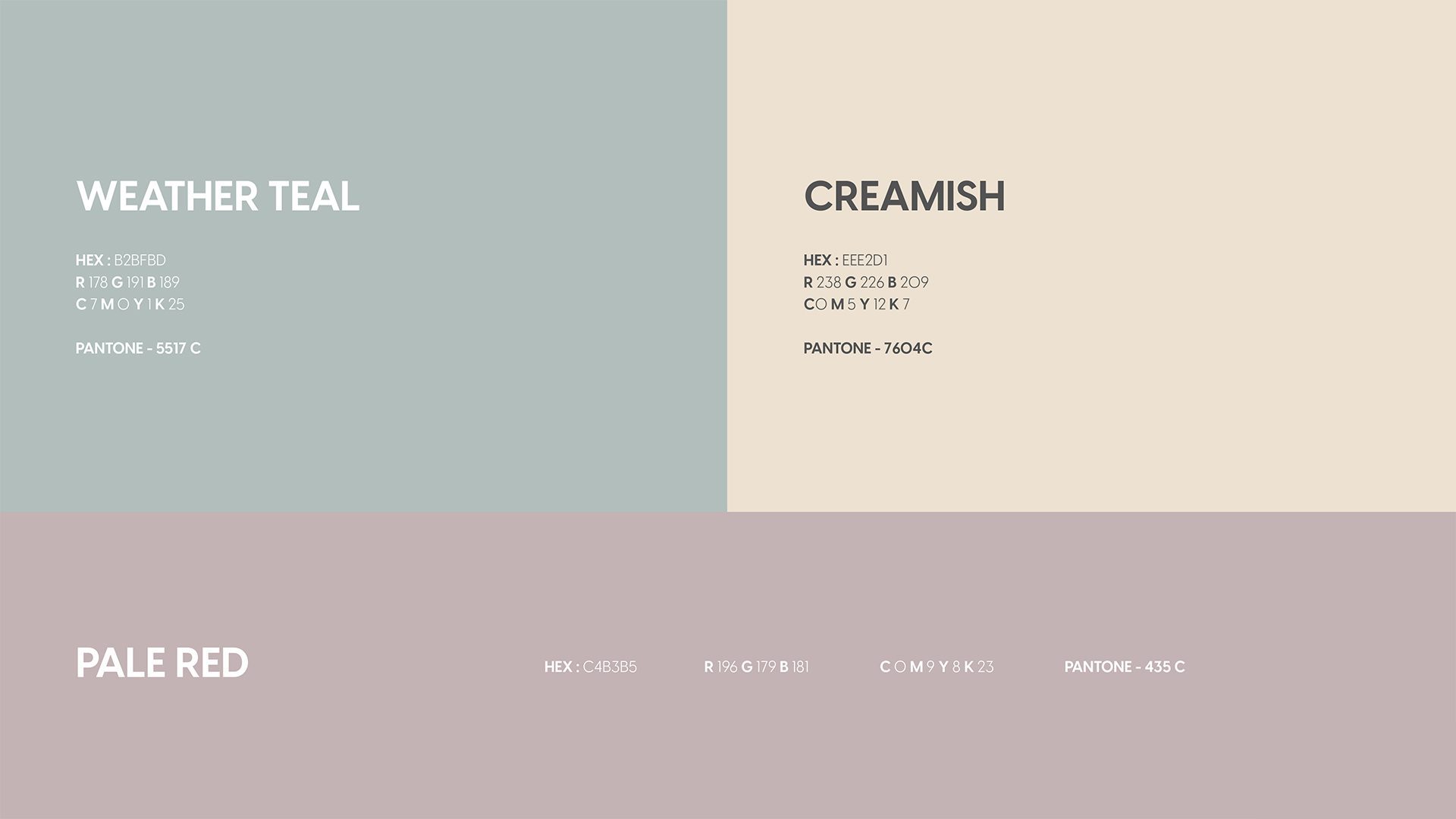
We designed congruent color pallets to match the energy of the Frank & Arlo company and were able to provide a wide range of options to choose from.
Case Studies > Frank & Arlo
The Result
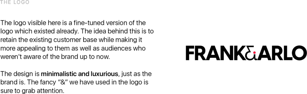
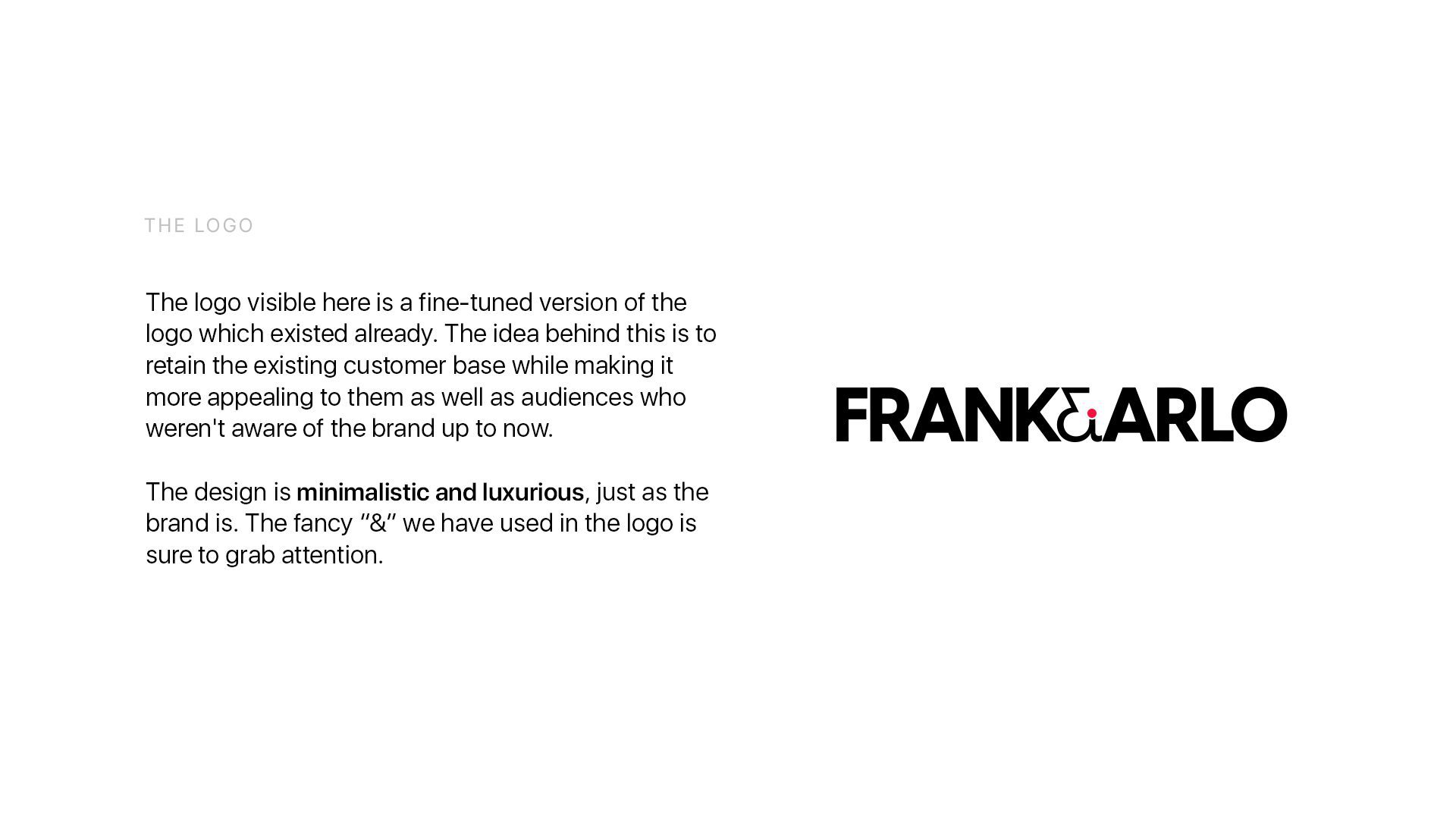
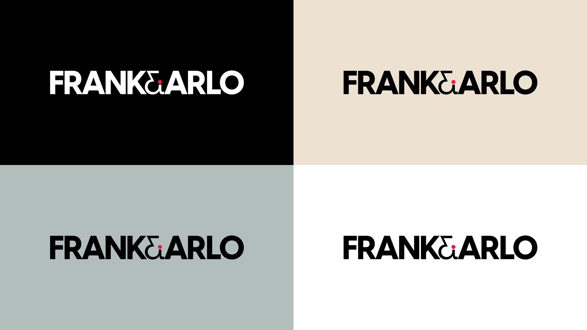
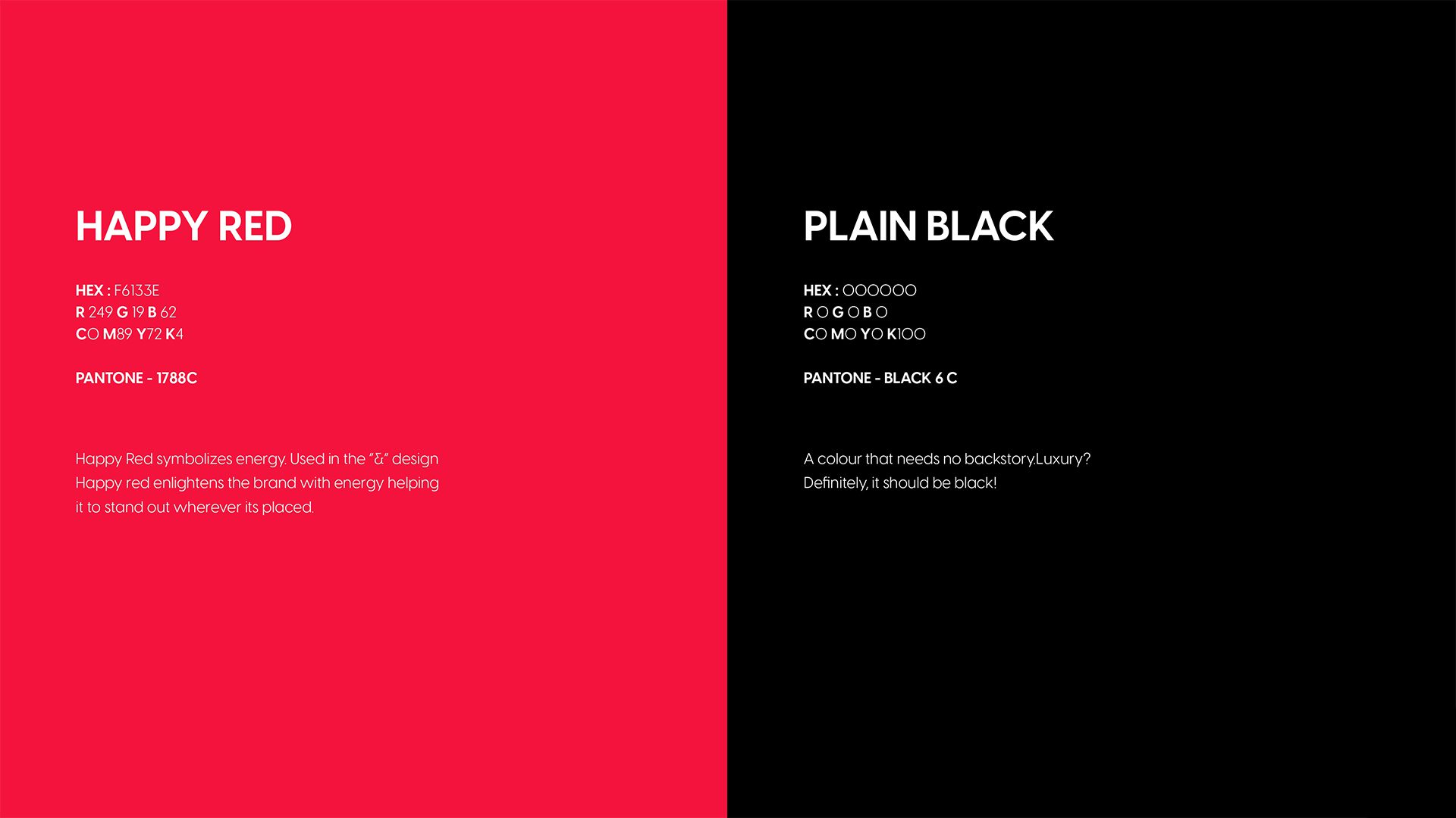
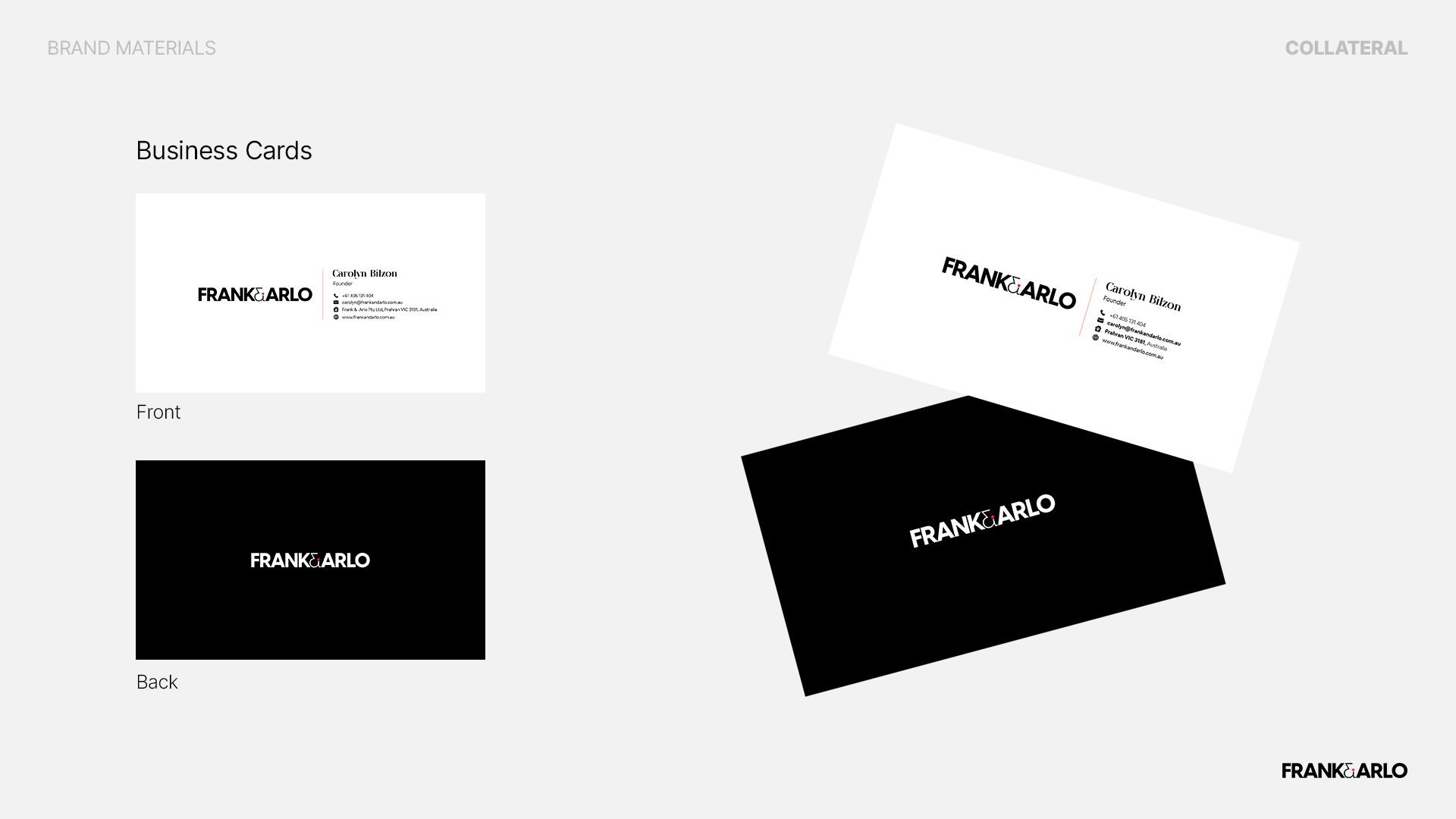
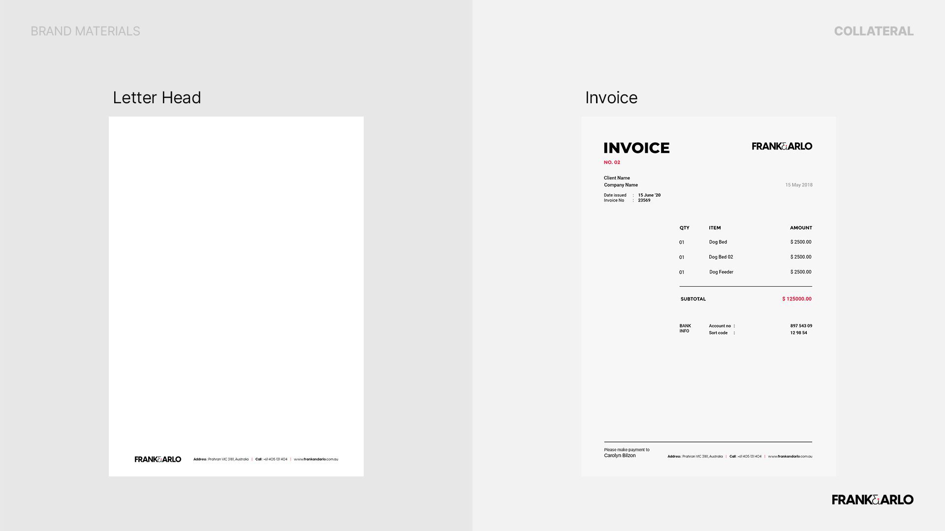
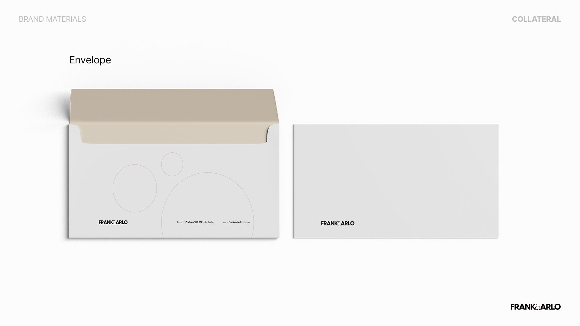
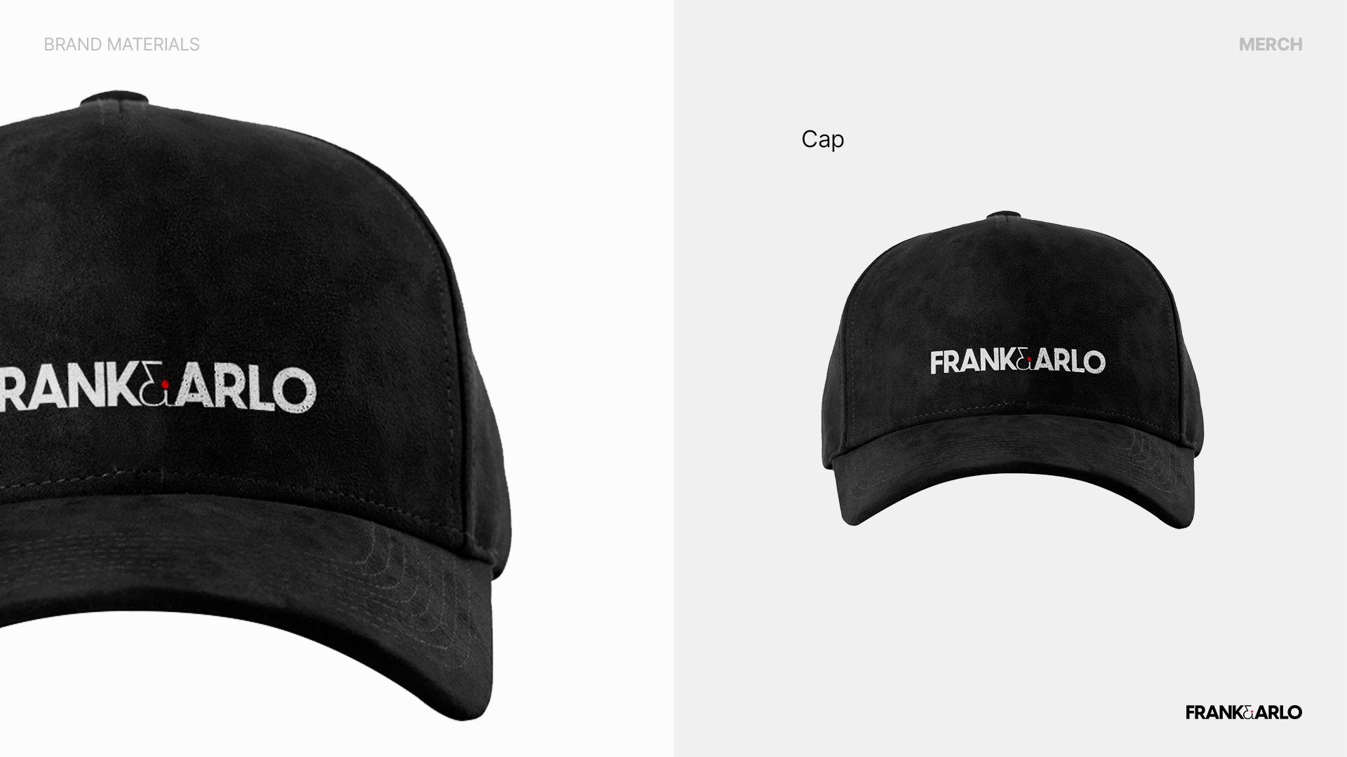
The finalized logo is a fine-tuned version of the logo that already existed. The addition of the color ‘happy red’ was to attract new customers while the retention of the plain black color was to maintain the luxury and for the previous customers to still be able to identify the company.
An efficient team consisting of Navinda, Thisara, and Thisal from BUOST, attended meetings which enabled the client and the team to agree upon the company’s fundamental values. The aesthetic ‘&’ incorporated with the red dot in the logo is a tactful way to deliberately grab one’s eye.
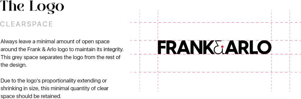
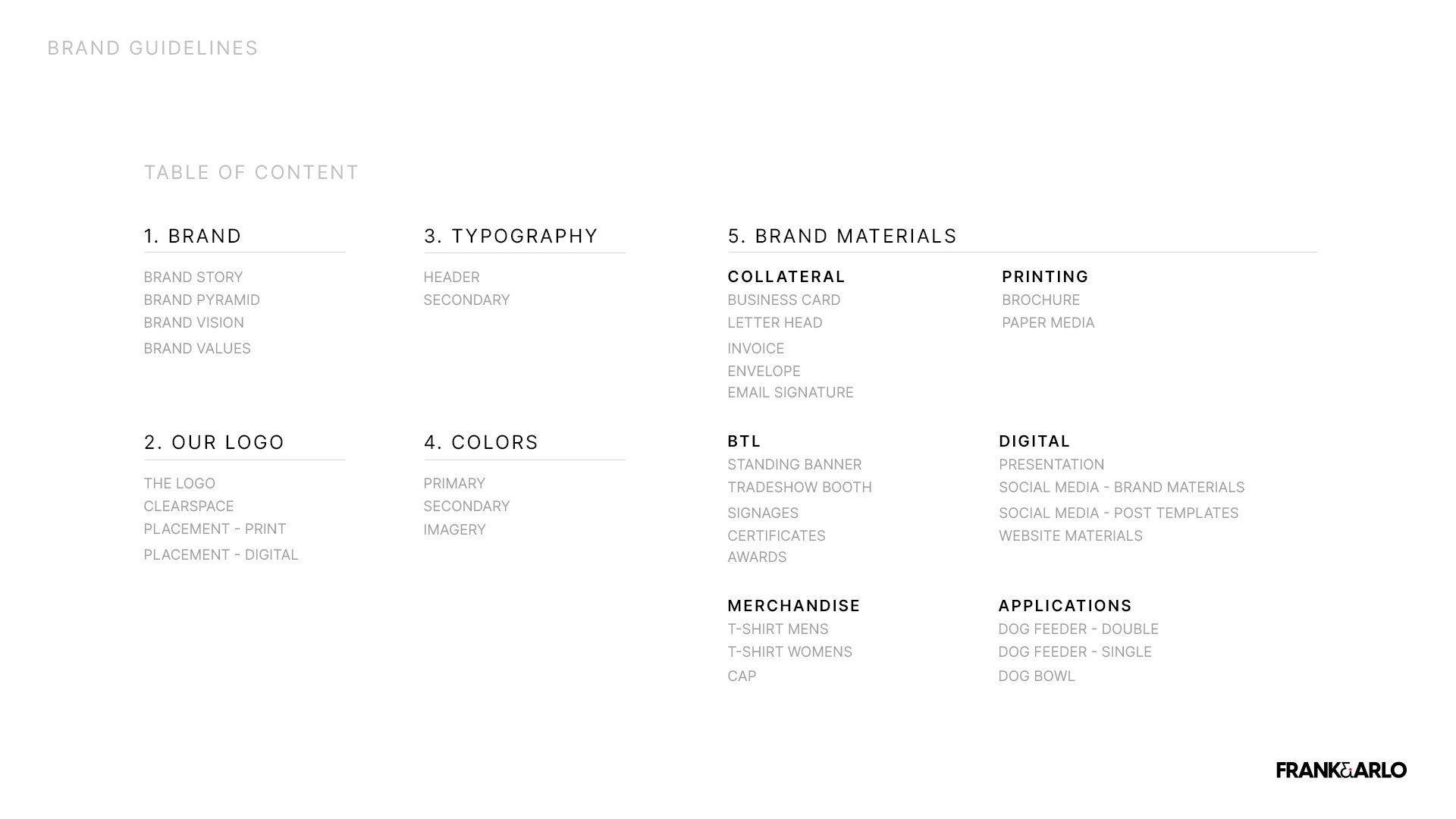
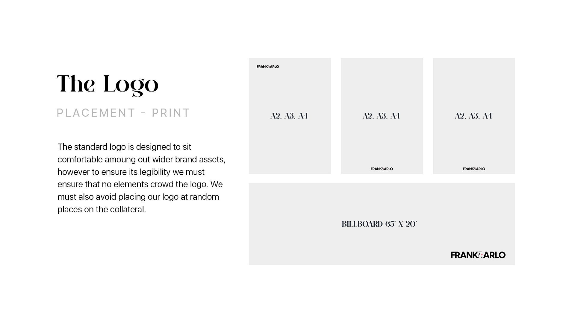
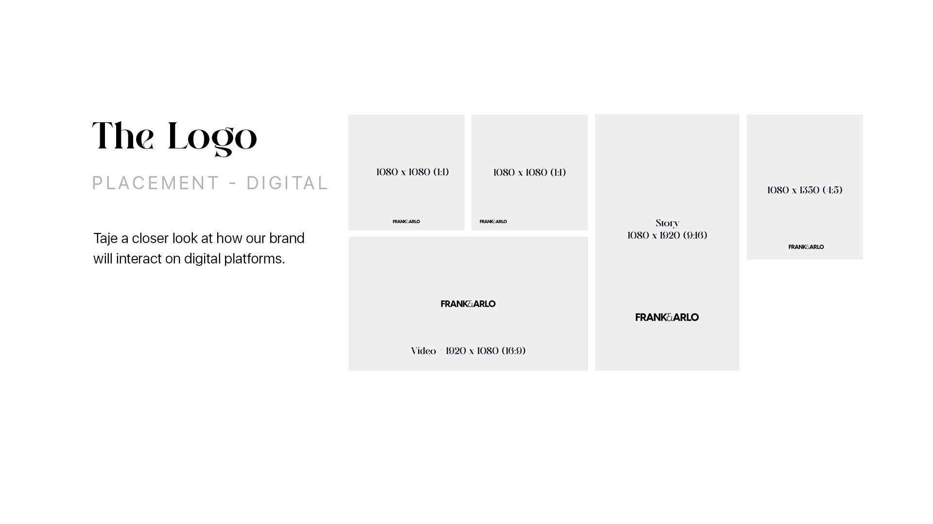
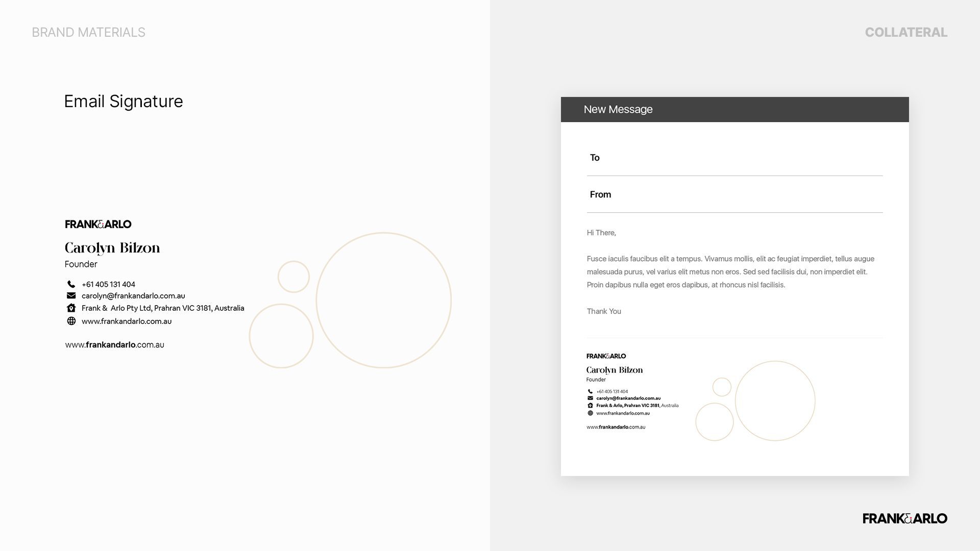
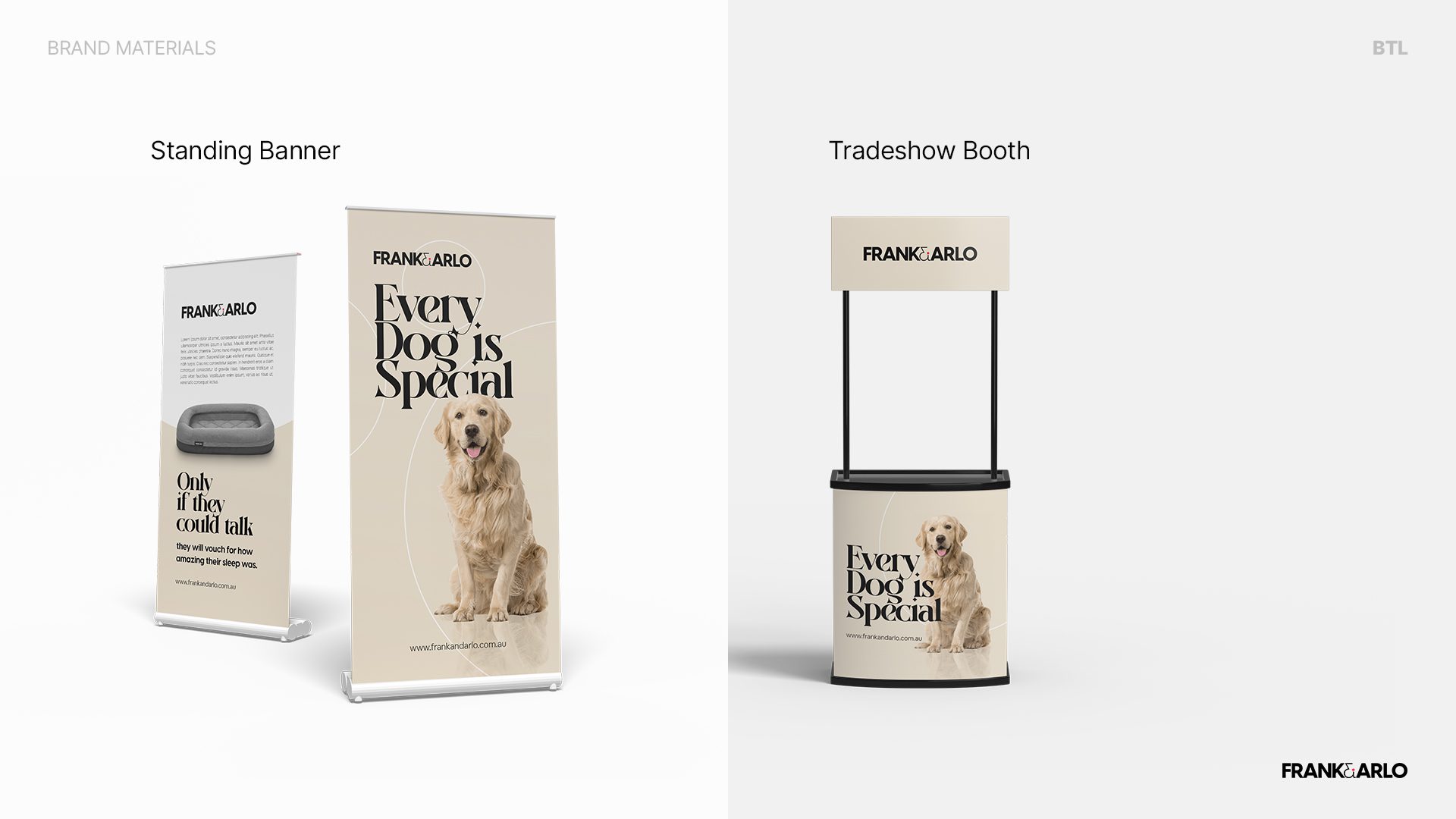
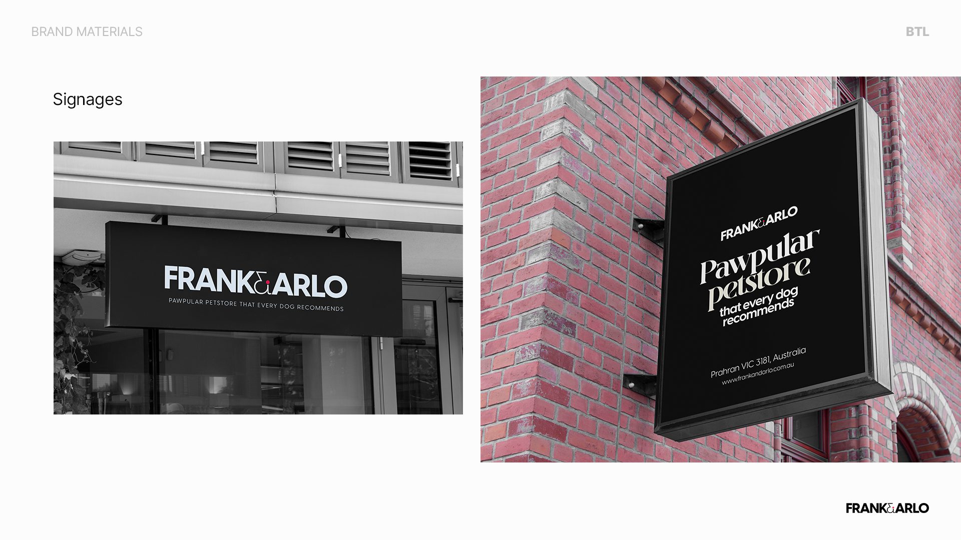
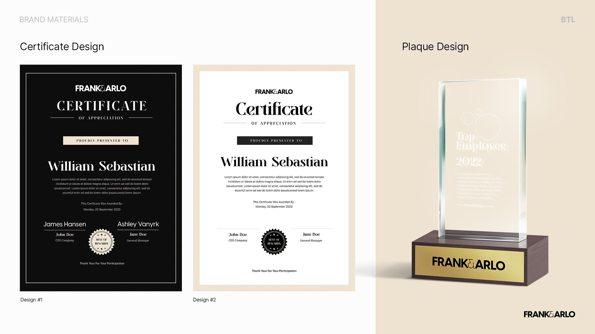
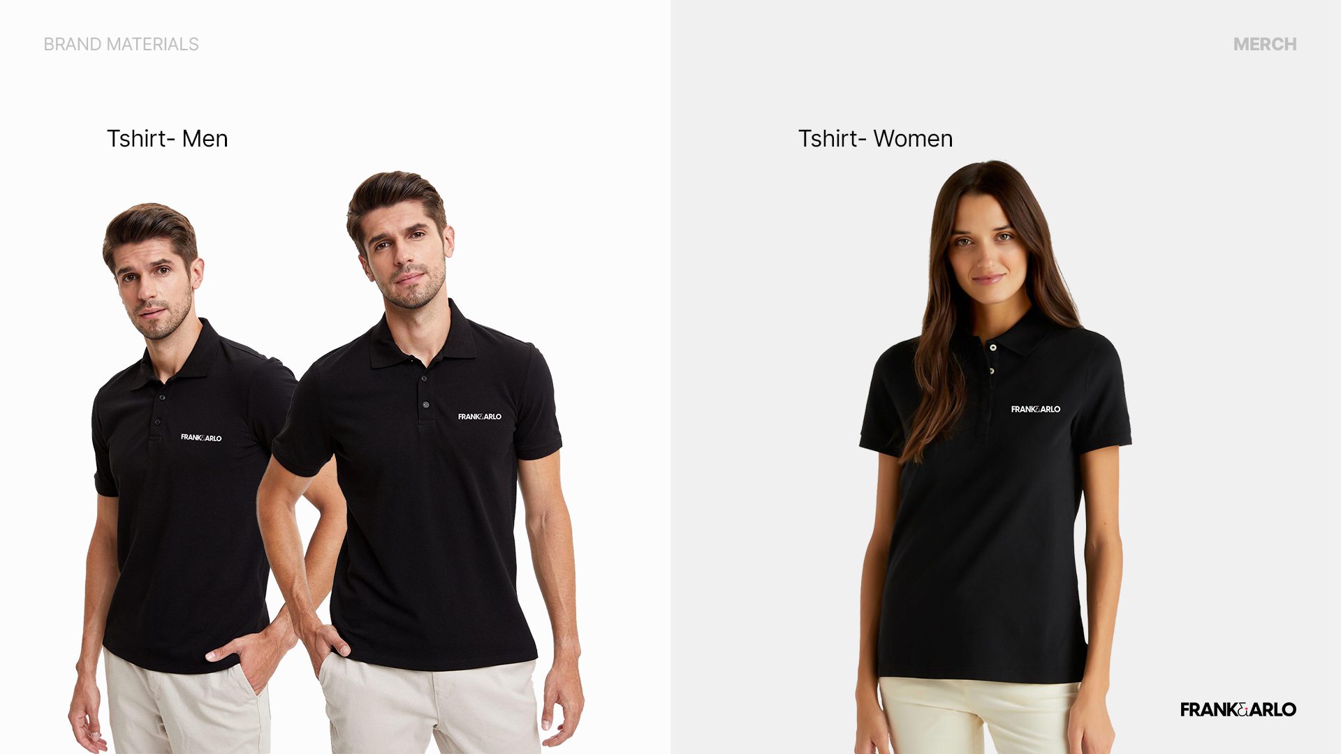
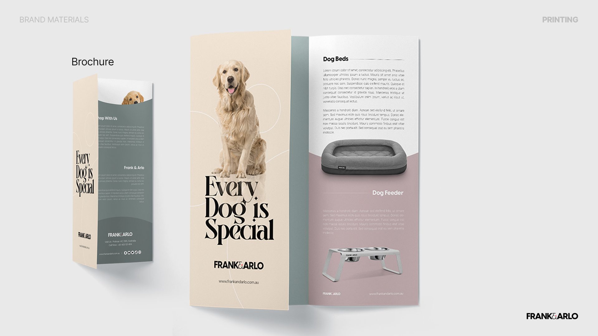
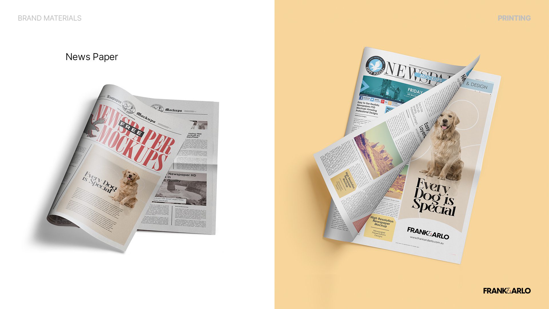
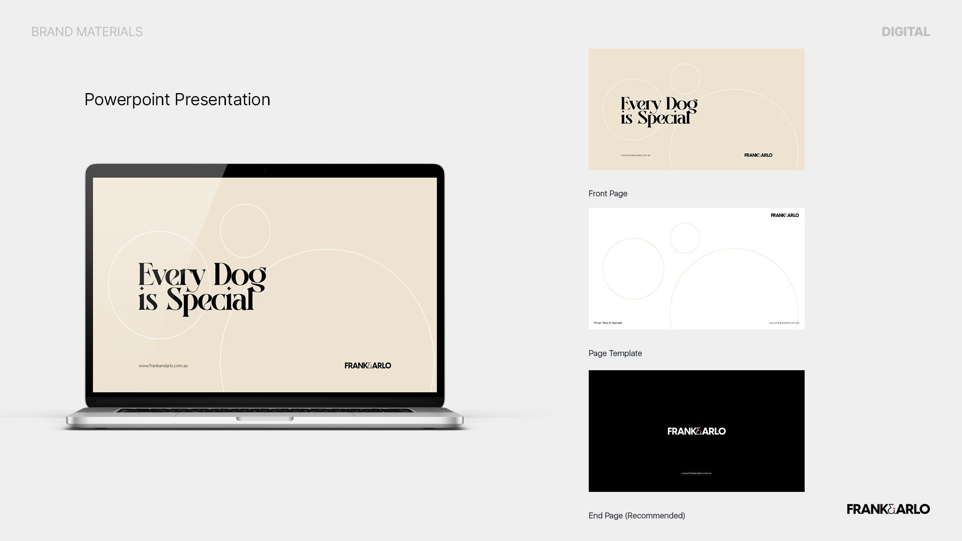
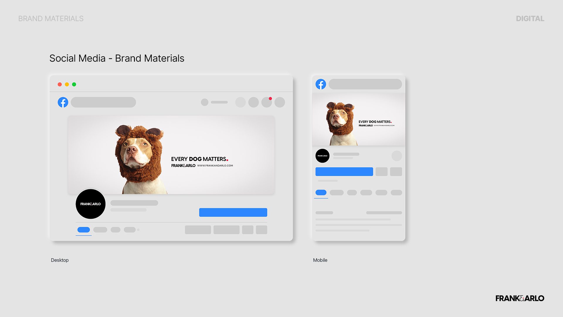
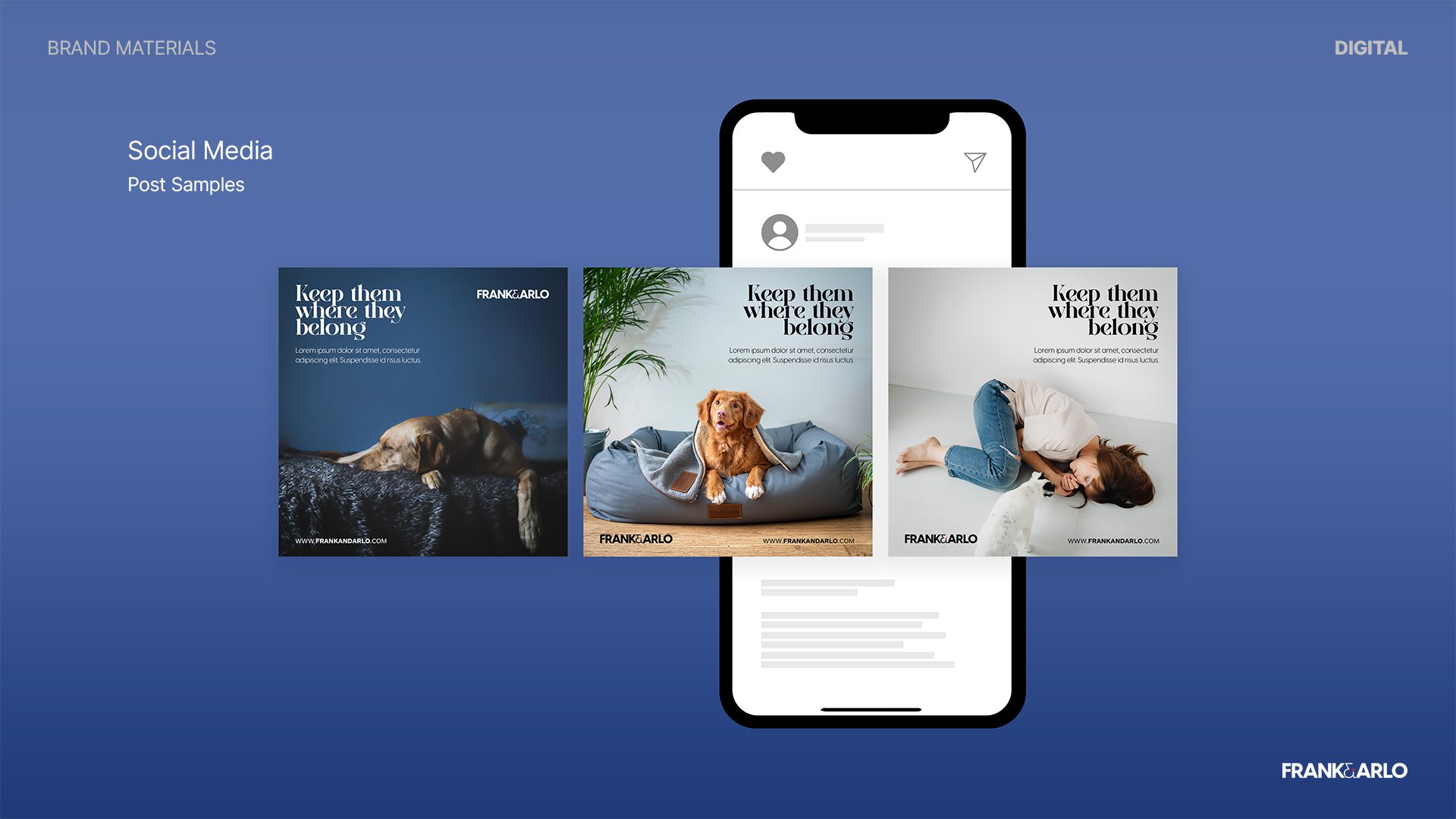
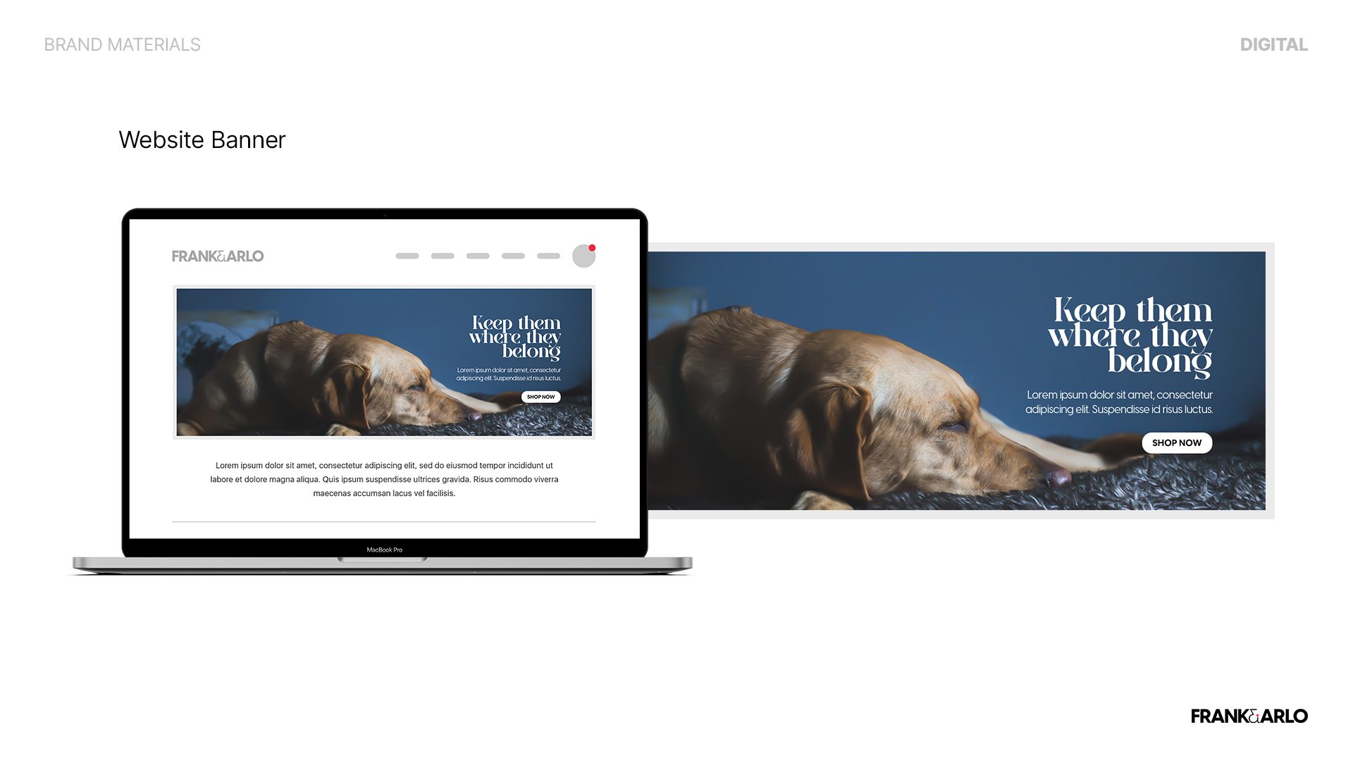
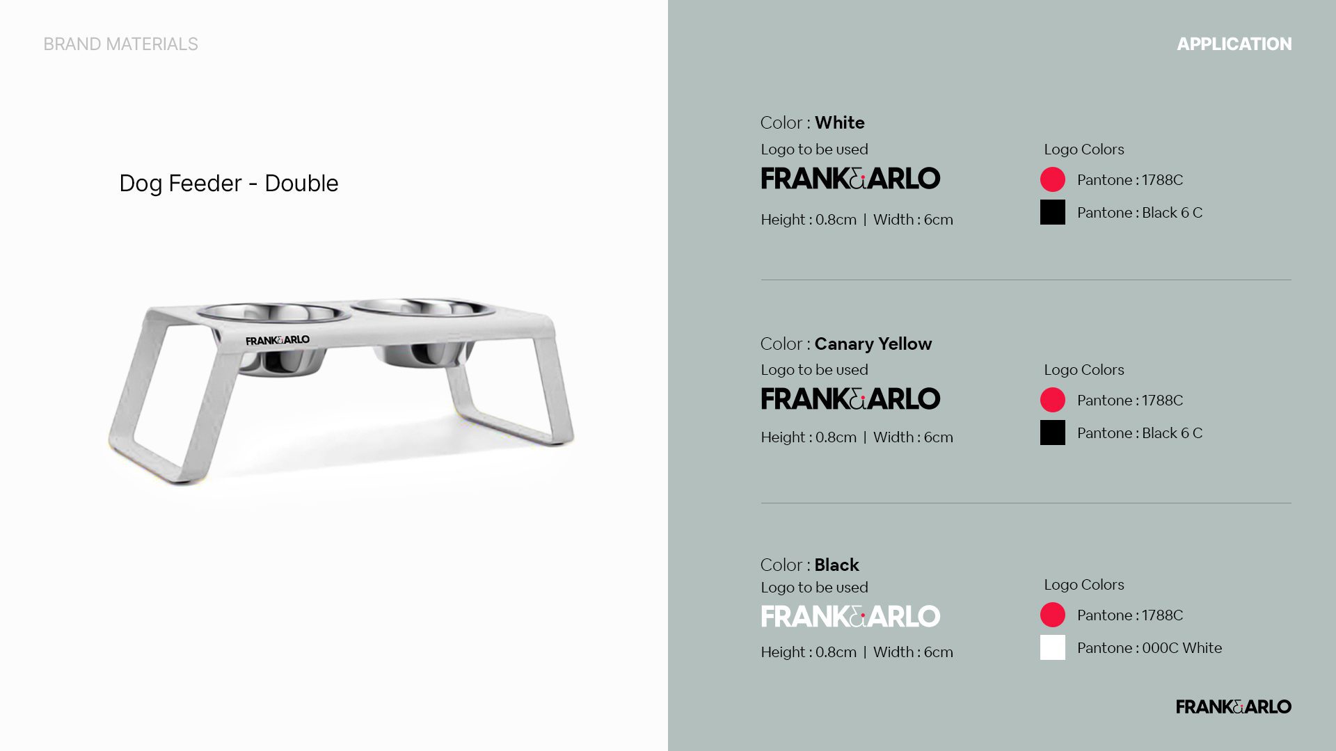
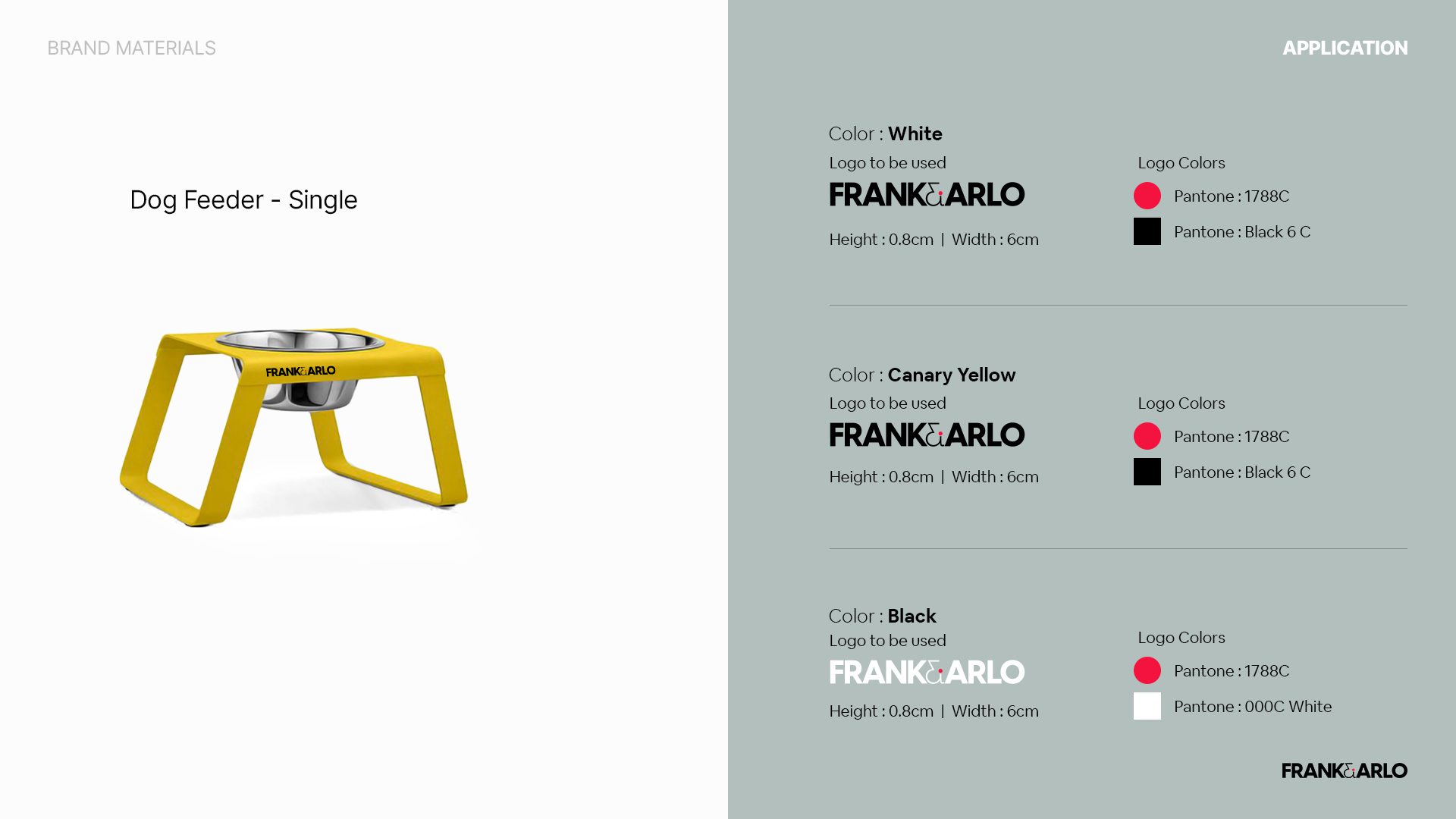
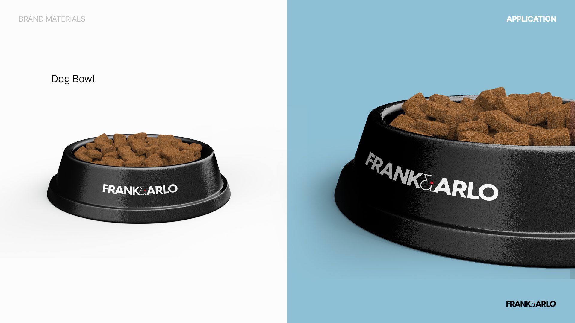
We also provided a comprehensive document on the characteristics of Frank & Arlo as brand guidelines, and our goal was to supply guidelines to remain consistent and acquire lasting attraction.
Disclaimer Note :
The following case study presented for BUOST is intended for informational purposes only. It is important to note that the information provided in this case study is based on hypothetical scenarios and should not be considered as factual or applicable to real-life situations.
Readers are advised to exercise their own judgment and discretion when interpreting the information contained within this case study. The content provided should not be construed as professional advice, financial guidance, or legal counsel. The authors, contributors, and publishers of this case study bear no responsibility for any decision or action taken by readers based on the information provided herein.